
A Jupiter case study • 2021
Building trust into Jupiter’s black-box prediction model while lifting precision to 62%

Autopilot is automated grocery shopping
The feature originated as the idea of “The pantry” on Jupiter. It was a machine-learning-powered prediction model that built a customer’s shopping cart based on their past purchases.
State of “the pantry” feature

The original pantry feature
The first iteration of the prediction model tracked every item a customer has ever purchased.
It then ranked them from high to low probability and added items to the cart until it hit a dollar threshold self-reported by the customer as their “budget” during onboarding.
The probability model is a bit of a black box and has hindered our ability to communicate why we are predicting the items we are.
The success of the model is measured by its precision and recall. You can think of precision as the prediction’s quality score and recall as the quantity of right answers predicted .
The first version had low precision— at about 48% — but high recall at 83%. We interpreted this as we were overfilling carts and forcing customers to cull before order finalization; therefore the high recall was happening more by accident than by design.

The Jupiter order cycle
Jupiter’s order cycle is a weekly subscription model. The customer’s delivery day is determined by their neighborhood.
The week begins with a cart predicted by our ML model. Then, a customer has 5 days to review, edit, and add to their cart. The order window closes at the end of the 5th day. The order is processed and delivered to them on their regular delivery day.
Then it begins all over again.
Why improving cart predictions matters
Improving the prediction feature was advantageous because it was the centerpiece of the Jupiter subscription. We saw that subscribed customers retain and engage at a significantly higher rate than customers who place one-off orders.
Our definition of success
This project aimed to increase our precision (quality score) by 10 points while maintaining our current high recall.
At the same time, we wanted to maintain our current $100 AOV (average order value).
How the prediction model is changing
This project was initially driven by improvements happening behind the scenes.

Canonical groups rather than SKU-level mappings
Previously, we tracked all product SKUs individually. For example, if you bought a gallon of milk last week and a quart of milk this week we would have tracked them separately as if they were different items versus understanding they were both equally fulfilling your desire for milk.
We had developed the concept of canonical groupings. This grouped like items together so moving forward our model would track and predict at the group-level — say “1% Milk” and then be selecting a specific SKU from the group to add to the cart.
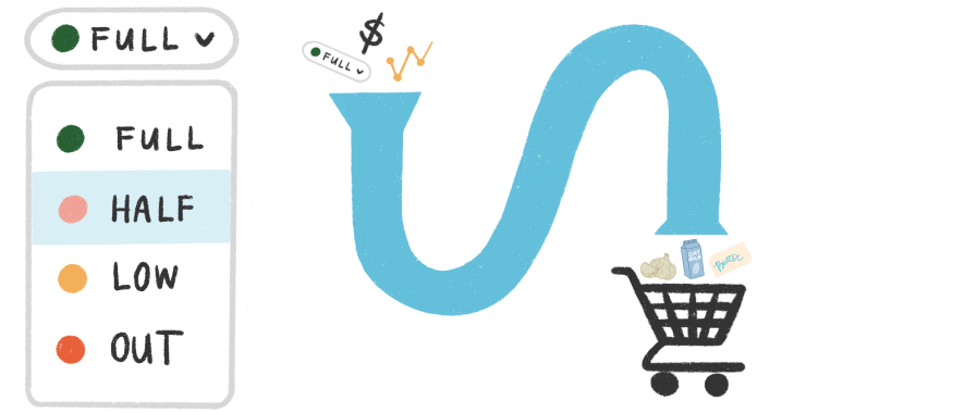
Develop heuristics for better predictions
We also wanted to define and consider a customer’s individual consumption rate when we were predicting items. The first version of the model relied solely on inventory tracking which proved to be a bit too simplistic.
User problems

The team was me, a product manager, and 3 engineers — one frontend, one backend, and one ML.
As a group, we began by documenting user tasks and mapping them to business needs. This activity helped to kickstart early conversations about the detailed feasibility of the model and what information we would need to allow for the most precise predictions.
Documenting our user problems also helped to identify our primary goals for feature improvements. Even though we make decisions on the user’s behalf, we wanted customers to always feel in control of their grocery shopping. We wanted them to feel like Autopilot saved them time, not required more of their time.
Explorations
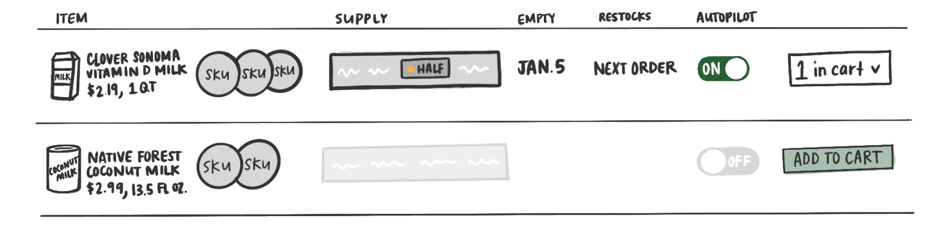
Outlined requirements
Outlining user problems and goals allowed me to define a set of requirements that directed my early explorations. I began by evolving the current row layout. The biggest challenge was communicating the group and product SKU hierarchy.
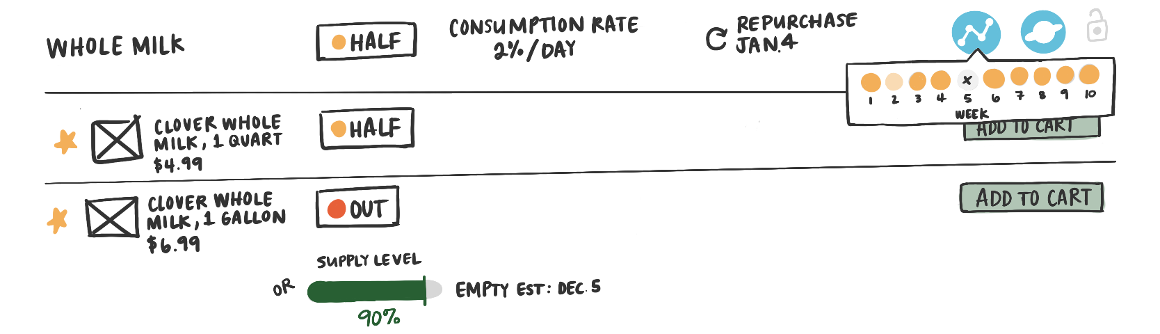
Defining information hierarchy
Next up was exploring how the pieces of information most important to the model are communicated. This includes supply levels, consumption rate, and repurchase prediction.

Evolving from a table to a card
I wanted to create more visual separation between a group and its embedded SKUs. The design evolved to a card layout so the group and SKU list could be isolated in different views.

Group vs. SKU
The card UI allowed SKU-level information to be displayed in a modal, opened on card tap. Overall, this allowed more flexible real estate for all the information and functionality we wanted to surface.
User feedback
We put early explorations in front of customers during 1:1 virtual interviews and we learned several things immediately.

First, users weren’t nearly as interested in their order or consumption patterns as I was.
Second, the symbols I was using to signal product preference weren’t quite landing. Customers weren’t feeling like the visual matched the action being asked. I was finding the heart to be the most successful because users intuitively attached language of “liking” a product to the use of it.

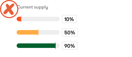
Lastly, keeping the inventory levels as descriptive terms vs. percentages was preferred. Customers were overthinking the need to be precise when asked for it as a percent.

How customers engage with Autopilot
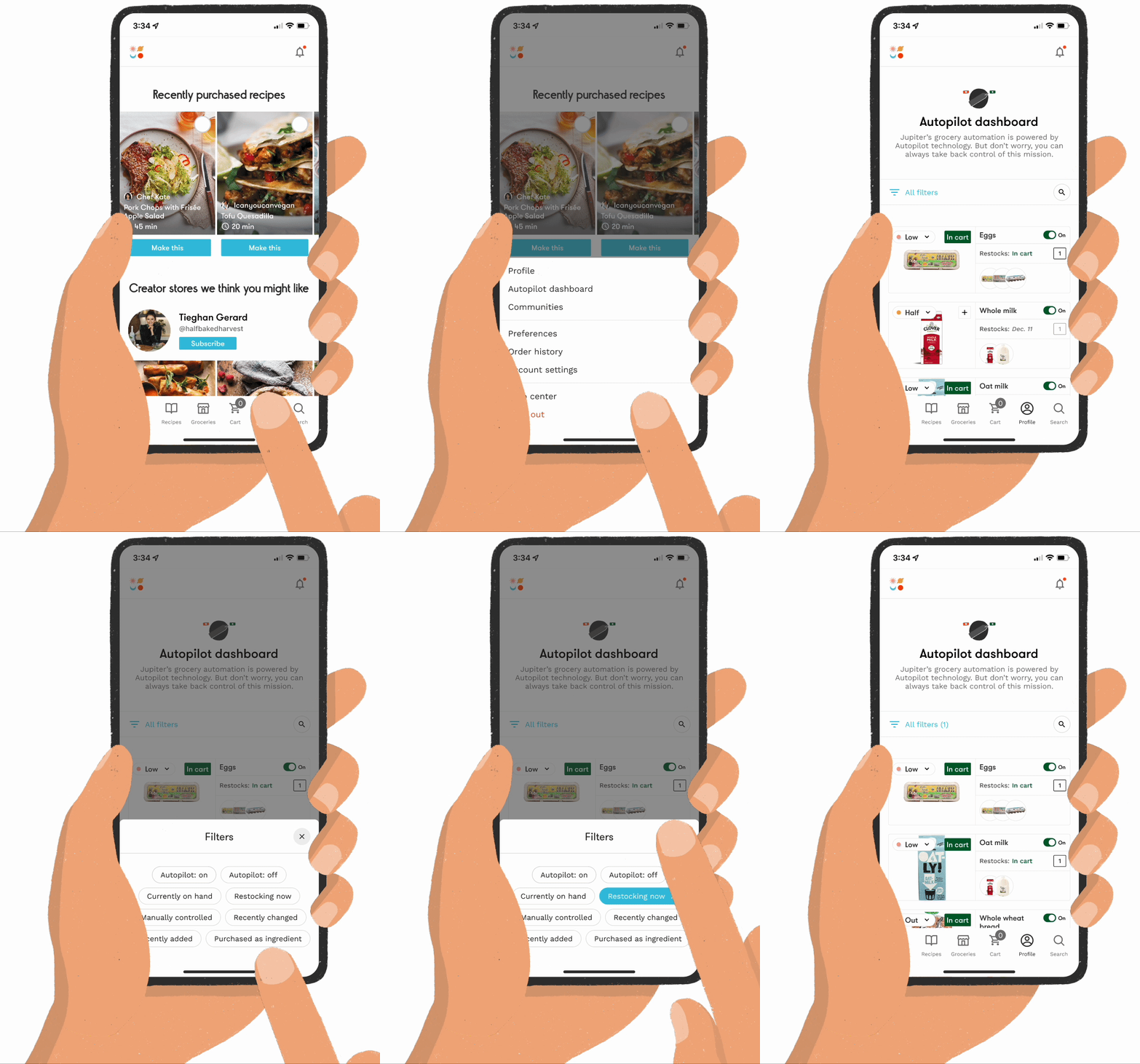
Use case #1
Autopilot should be easy to find and I should be able to easily complete the task I came to do.
We moved dashboard access to the top level of our user’s menu. On the dashboard, we incorporated shortcut-style filters that mapped to a items’ status. This allowed users to access only the products needed in the moment. We also saw that user’s relied on the product image when looking for items on their dashboard. The new card layout allowed the imagery to be much larger than the previous table format.
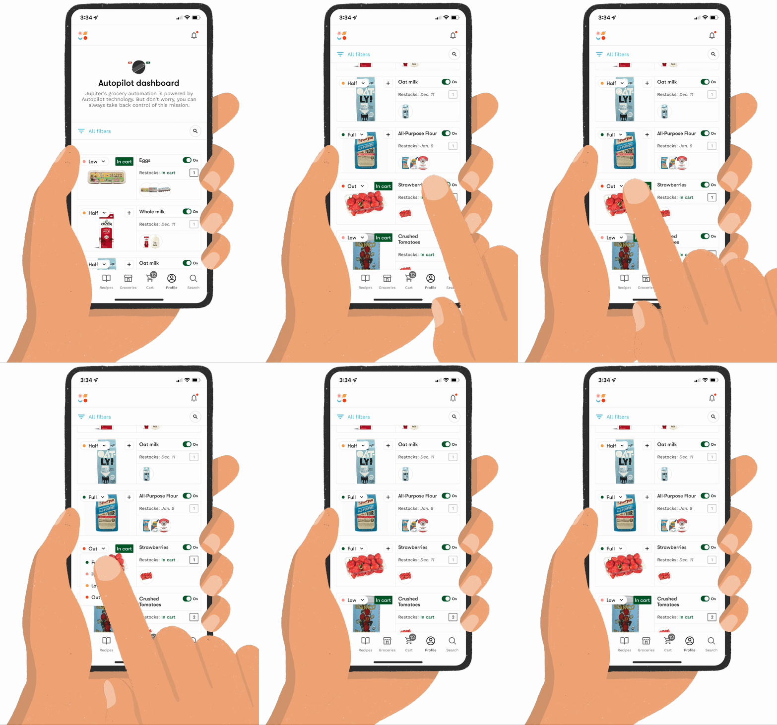
Use case #2
If I happen to shop elsewhere I want to be able to make adjustments so my predictions remain accurate.
Let’s say the customer has purchased strawberries. They can change the supply level of the item and the model will adjust accordingly. Therefore, they do not end up with more strawberries than they want or need.

Use case #3
I am brand loyal to some products, and more flexible with others. I want to control my tolerance for substituted items.
When tapping into a group you see all the corresponding SKUs that a customer has ever purchased. Customers can select a “favorite” item and the model will prioritize that SKU when available. Customers can also identify what listed items are acceptable substitutions. They can also delete unwanted SKUs from consideration.
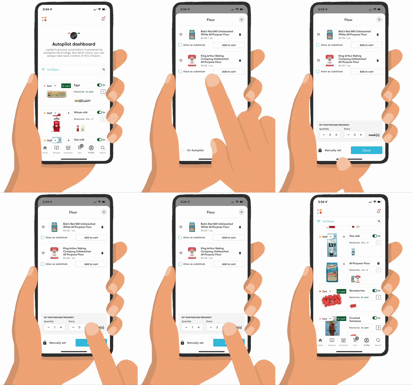
Use case #4
I know best how often I need to purchase flour. I don’t trust Jupiter to know how often I need to purchase it.
Here the customer is choosing to manually set the quantity and frequency of all-purpose flour. Autopilot will abide by their rules and add it to their cart on the schedule set by the customer.
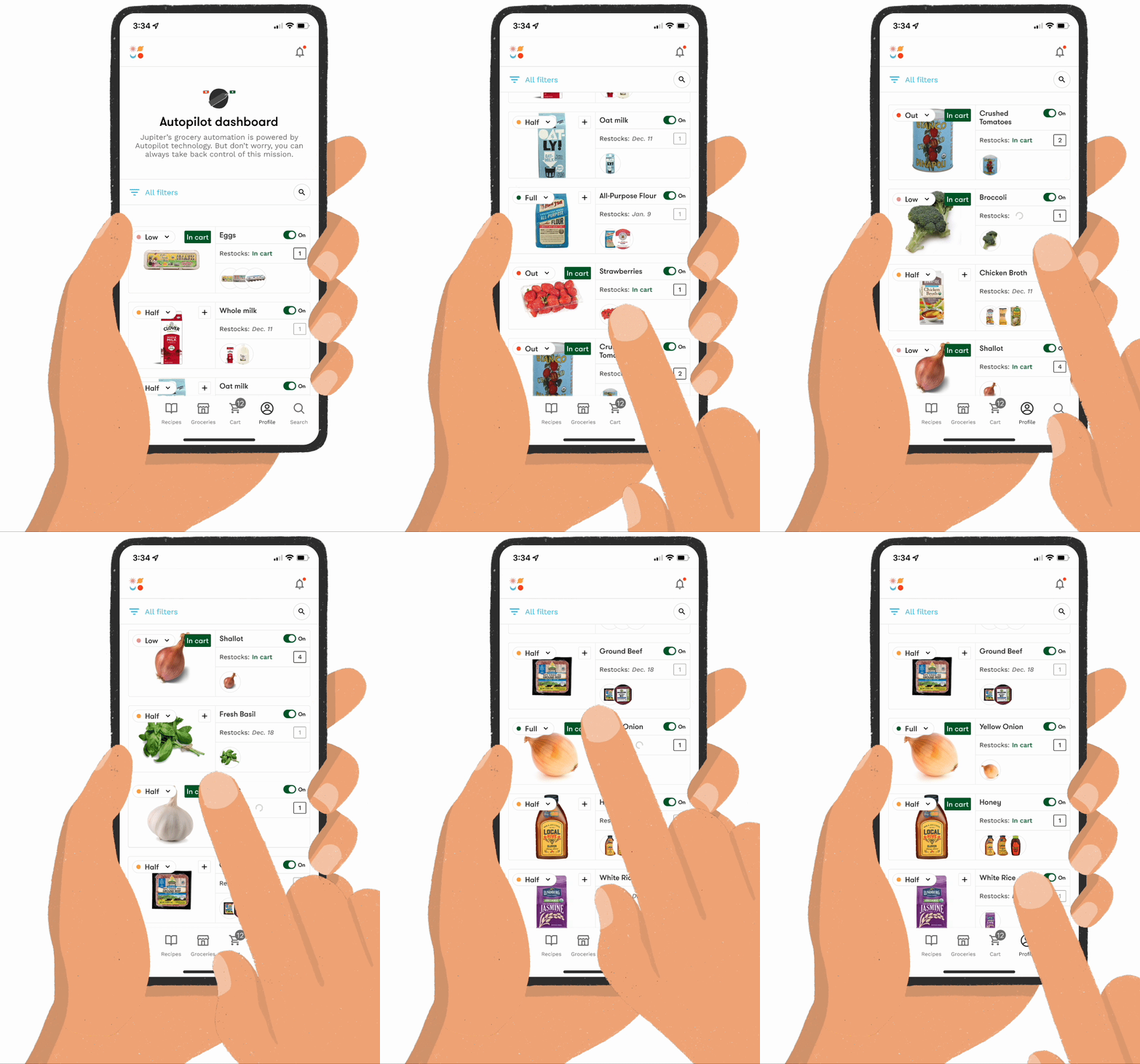
Use case #5
My Autopilot dashboard centralizes all the groceries I regularly purchase. I want to be able to shop for one-off items without having to return to the market.
Through our interview with customers we also learned that they think of the dashboard as a one-stop destination for everything they regularly buy. We saw them use it as a filtered marketplace. We wanted to maintain this behavior and make sure that the items could be purchased at both the group & SKU-levels.
A customer could visit the dashboard and quickly shop their most frequently purchased items. Adding items to their cart from the card-view leverages the same SKU-preference information that the model relies on. Any deviation on the user’s part from their buying patterns either inventory, quantity, or item would get incorporated into the model post-purchase.
Use case #6
If Jupiter is making adjustments & choices to the items I have on Autopilot —even if in my best interest—I want to be aware and able to make changes if I disagree.
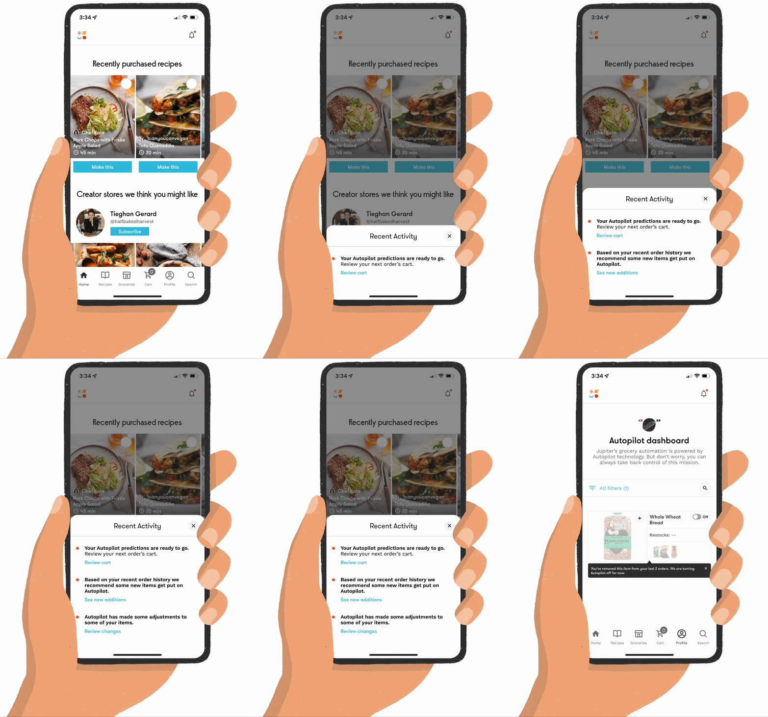
Thinking back to our goals, one was keeping customers aware of what the model is doing. Not in a “requires their action” sort of way, but in an effort to answer “why?”
Notifications are triggered at certain milestones. Each week a customer is notified when their cart has been created. We inform them when we add items to Autopilot — the threshold was after an item has been shopped 2 times within a certain timeframe. And we also let them know when we turn Autopilot off for items. This happens when the customer has completely removed an item from their cart multiple times.

Use case #7
I want to know what has been predicted to my current cart.
Finally, since we are adding items to their cart we want them to know how an item got there.
Each item is tagged based on how it was added to their cart. Autopilot predictions are identified with a blue Jupiter icon. Items that are ingredients in shopped recipes get a yellow icon. And items added by a user are identified with a grey icon featuring that user’s initials.
Items can also be in the cart for more than 1 reason. You can see instances here where more than 1 icon is displayed. For example, you can add an item from the market, and then you can shop a recipe that requires that same item as an ingredient. We assume you wanted that item regardless of the recipe so calculate the sum quantity. As always, a customer has full control over making changes all the way up until their order is finalized.
Impact of our improvements
Precision

Was 48%, increased to 62%
Our goal was a +10 increase

Recall
Was 83%, decreased to 81%
The goal was for recall to remain stable, but this slight dip was hypothesized to mean there might be a slight disconnect between users’ stated budget and their ultimate AOV.

AOVs
AOV increased to $104
Our goal was to (at least) maintain our $100 AOV
Learn more about Jupiter’s business pivot with Jupiter recipe shopping.