
Step 1
Sign up / login modal

The original sign-up modals
Goals
Our top priority was increasing the number of sign ups that happen during the paper download step. However, we had 2 secondary goals that we wanted to keep in mind:
Single sign up experience across all entry points
Increase sign ups that use third party SSO options
The original sign up and login flows varied depending on your entry point, and not intentionally. From an engineering and UX perspective it made sense to adopt a single, unified experience.
Optimizing for third party SSOs were based on data breaking down sign up method by engagement. We learned that who signed up using Google had the higher engagement vs. other third-party logins or email sign-up. Therefore, we wanted to try to influence the selection of third-party SSOs as a user’s sign up method.
Design decisions

Our aspiration for a single, sign up experience required a more general modal design. In the original modal, we were using the paper PDF visual as emphasis for ‘Download’ and ‘Read more’ flows. Our assumption was that showing the paper served to remind the user what they were signing up to get.
My hypothesis for the new, smaller modal was that allowing more of the paper screen to be visible would be equally, if not more, motivating.

We were looking to cultivate long-term engagement and our data showed a significant difference in behavior between users who signed up with Google or Apple versus those who created an account with email or Facebook.
We based the order of sign up options on engagement data from highest to lowest. We able to successfully shift sign-up method with our order choice and differentiated the continue with email option to de-emphasize.
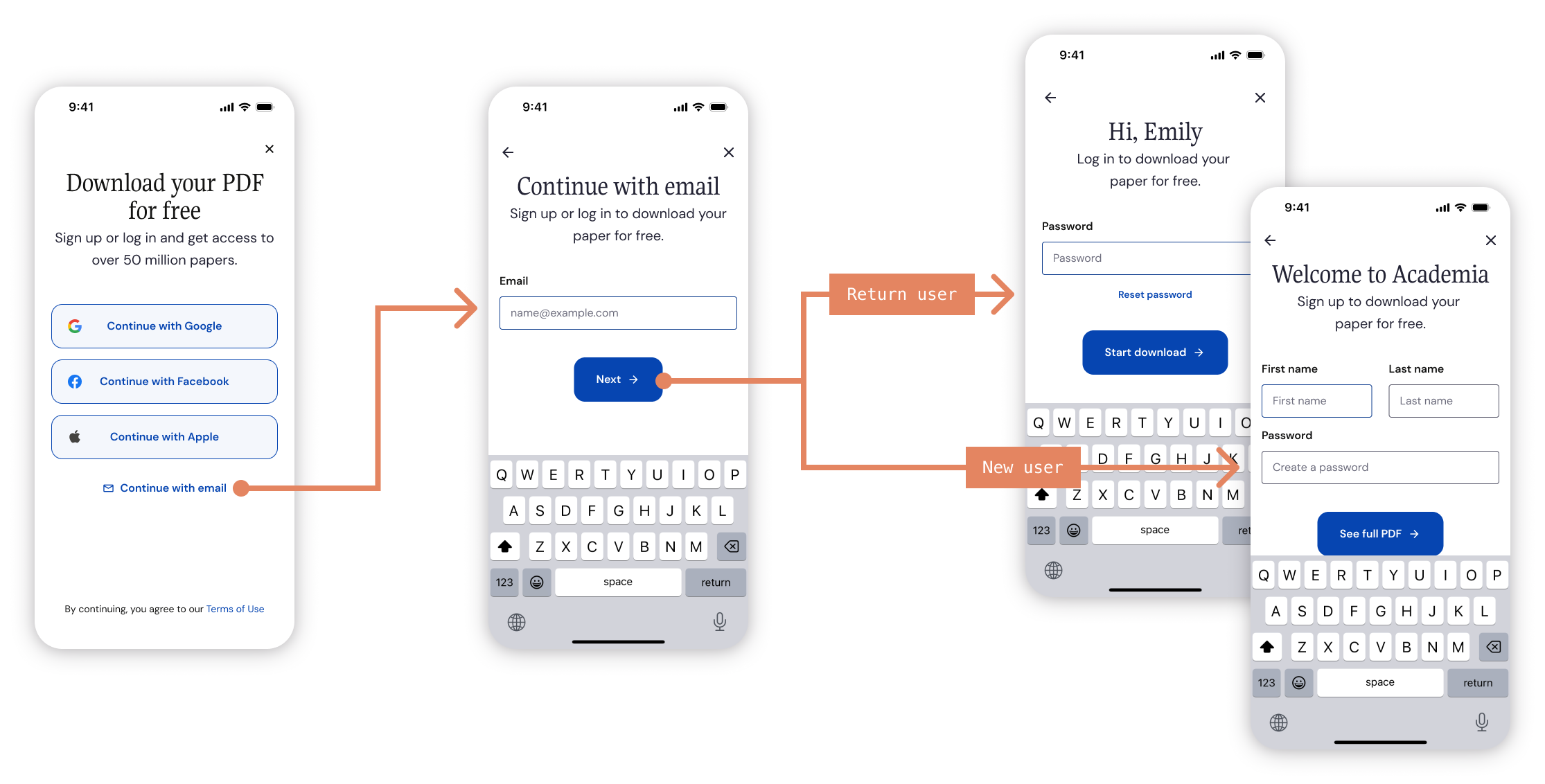
A common user experience that we saw was a user not remembering they had an account until they received “there is already an account that uses this email” error during sign-up. Consolidating the flows and routing the user to login or sign-up after an email check would resolve this headache.
How the improvements performed
First test
Second test

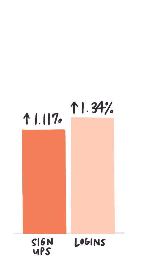
The modal change immediately saw a 1.1% increase in sign-ups versus the old experience. The incremental improvement from test 1 to 2 came from optimized modal copy and the restyling of buttons. I also shifted the continue with email button to a text link for test 2.
Logins improved by 1.3% with the new combined experience but remained fairly steady in future tests.

Breakdown of
sign-up method after
Breakdown of
sign-up method before
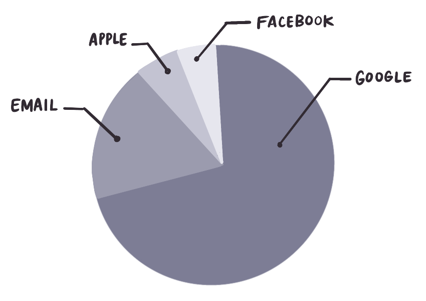
We learned that button order mattered when it came to sign-up method. We were able to influence users’ selection when we reorganized the button order.