
A Good Eggs Case Study
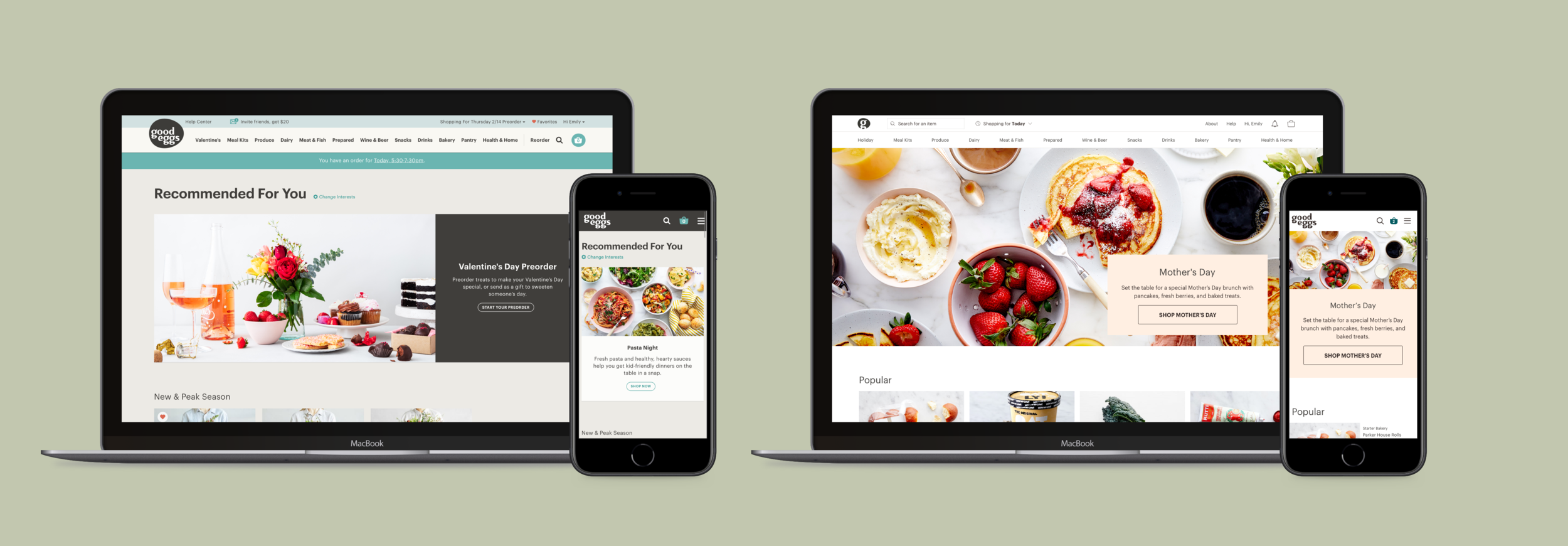
Home Screen
Background
The current web home screen offers little shopping guidance or inspiration. It is fairly static with limited customization or optimization available to the merchandising team. This can leave the page feeling stale and our data shows customers, consequently, do not spend much time on the page.
The iOS app does not have a traditional merchandising homepage. Instead, the home screen serves as category navigation for the marketplace.
We wanted the Good Eggs homepage to better facilitate dynamic storytelling opportunities and allow marketing and merchandising teams ample flexibility in the stories they tell and the products they highlight.

The problem
Our current web homepage is stale and not additive to a user’s shopping experience. On average our shoppers spend less than 5 seconds on the homepage per session.
What little dynamic space we do have is time intensive to update & maintain.
Project goals
Build consensus around the “job” of the home screen
Support existing requirements like: merchandising features, user interest module, and product round-ups
Define the tracking plan
Vet current content management tool for ability to meet new requirements
Support merchandising teams’ long-term goals
The project plan
The first step of this project was to gain alignment across product, marketing, & merchandising as to the purpose of Good Eggs’ home screen. What do we want a customer’s first impression of Good Eggs to be?
The expected outcome of this project was the creation of a modular system that stakeholders could leverage to independently maintain the homepage. The homescreen would be made up of pre-determined modules with a pre-determined hierarchy. It would then be up to the marketing & merchandising teams to leverage the library of modules to create features. The goal was to identify the proper set of modules that could meet the full extent of our storytelling needs. Then to prescribe enough constraints that guarantee an adaptable & cohesive homepage design without being too prescriptive and restricting the creativity of the editors.
What does Good Eggs want to be?
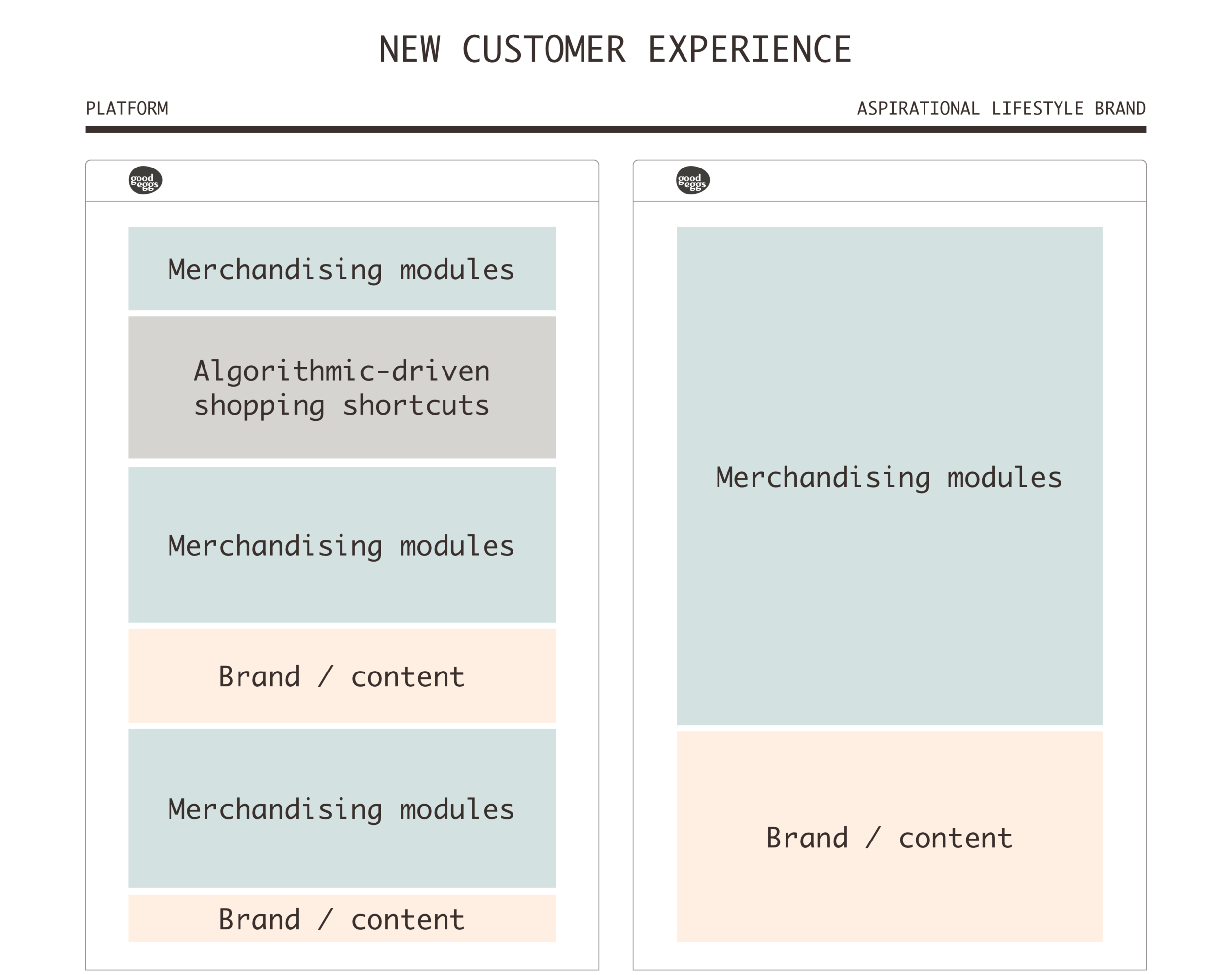
Alignment over the primary purpose of the home screen was the majority of this project. I distilled our potential options to be described as a question of if we wanted to be a seen as a platform, an aspirational lifestyle brand, or somewhere in-between?

If Good Eggs wanted to be seen as platform our principles would be:
The Good Eggs brand would not overshadow the brands in its marketplace.
Our primary goal would be surfacing new and interesting products based on a customer’s activity, preferences, and behaviors.
The Good Eggs brand would not have a strong point of view. The site experience would instead reflect the point of view of the customer.
The characteristics we would lean into if we wanted to be perceived as more of an aspirational lifestyle brand:
Promote a lifestyle as much as the products
Emphasize a strong brand vision & perspective
Recommendations would have the authority of Good Eggs’ expertise & POV
Introduce curated content

For Good Eggs, it became clear that the answer was more ambiguous. The Good Eggs brand & POV were as valuable as the brands & products in our marketplace. Our long-term vision includes the expansion of editorial content and the introduction of recipe content. This would move us more in the direction of a lifestyle brand. Yet, we also want to personalize customers’ shopping experience and adapt their site experience to their shopping behavior and personal interests.
Possible page frameworks
As we continued to determine where we want to wanted Good Eggs to live on our platform-to-lifestyle-brand spectrum I explored how those definitions would impact the content flow of the page. The percentage of real estate dedicated to brand & merchandising content is higher for the aspirational brand whereas the platform would lean toward surfacing shopping shortcuts more prominently and frequently.


Content modules

I took to paper to start to explore what the individual modules would look like. My goal was to balance the need for thought-through templates without being so prescriptive that I zap all creative opportunities during their creation.
Module types that I explored included:
Curated product content
Meal planning inspiration
Seasonal cooking inspiration
Producer Spotlight
Shoppable blog content
Thematic collections (New to the market, Good Eggs favorites, On Sale, etc.)
Algorithmically-driven product shortcuts
Recently viewed
“Your Staples” / Reorder
Recommendations based on your shopping
Customers like you also purchased
Popular near you
Your top category

The selection of the final modules was largely driven by what we were hoping to accomplish. An early goal for the homepage was better facilitating dynamic storytelling opportunities. Therefore, surfacing product was not the only prerequisite for modules. They also needed to support additional copy to inject those moments of narrative.
Furthermore, I looked to create opportunities on the home landing page where we could highlight the breadth of our marketing, social, and editorial content. Today, those touchpoints happen outside the marketplace but have the potential to be fantastic sources for storytelling.
Page layout explorations

Getting this thing built
The original homepage was built using a content management system (CMS) called Prismic. It had not aged well and required our merchandisers to do a frightening amount of HTML. The successful outcome of this project included a technical decision regarding our CMS future. Either re-build our Prismic infrastructure or adopt a new CMS.
We decided on the latter path. We chose Contentful as our new CMS and worked with an outside agency to get Contentful up and running.
The final modules
The page’s design is intended to be modular to allow the marketing and merchandising teams ample flexibility in the stories they tell and the products they highlight.
The homepage is made up of a series of content modules. The library will begin with 8 modules available pre-built in Contentful. The page layout, as well as each module has some basic UI structure while still allowing lightweight customization.
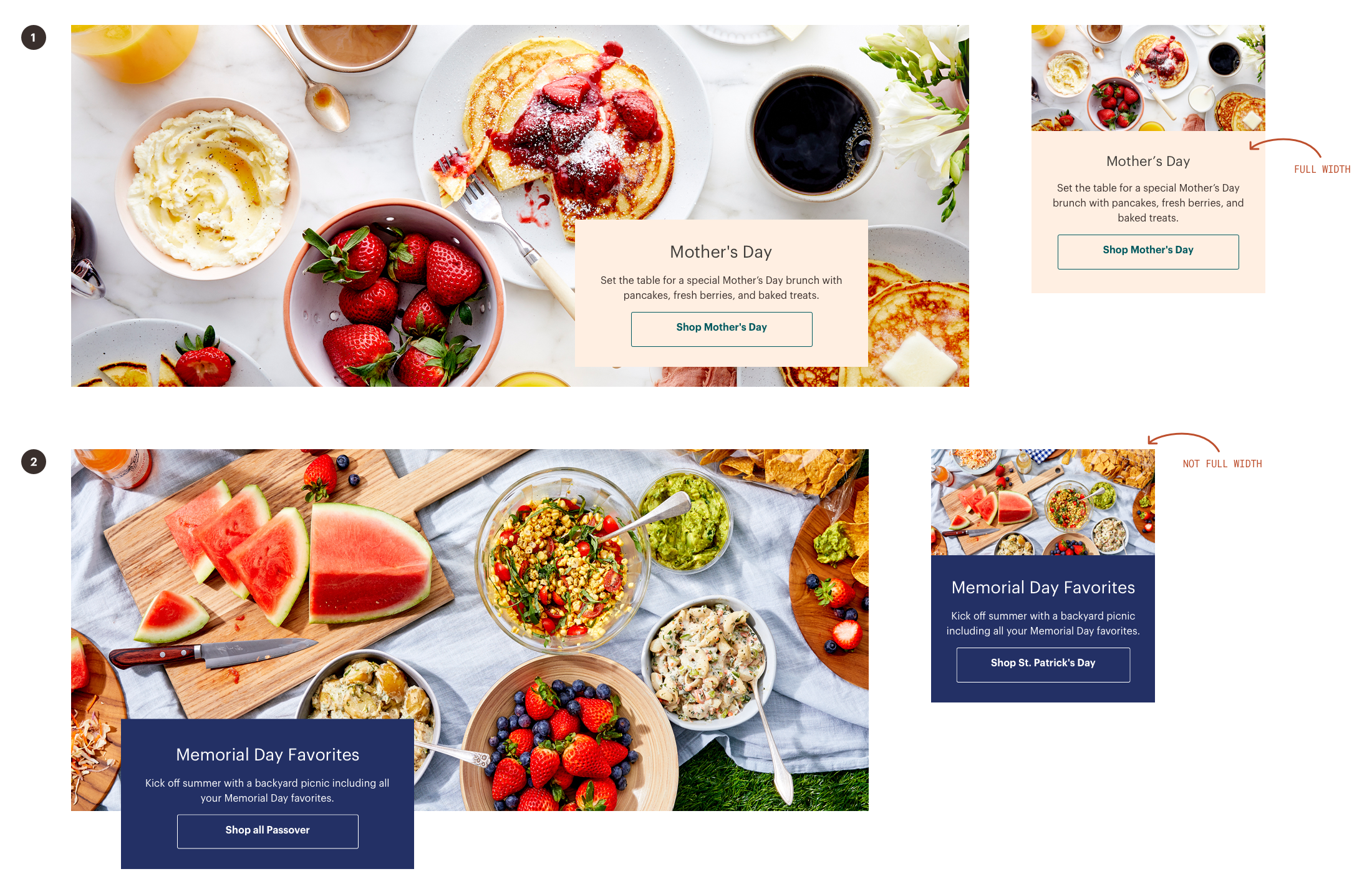
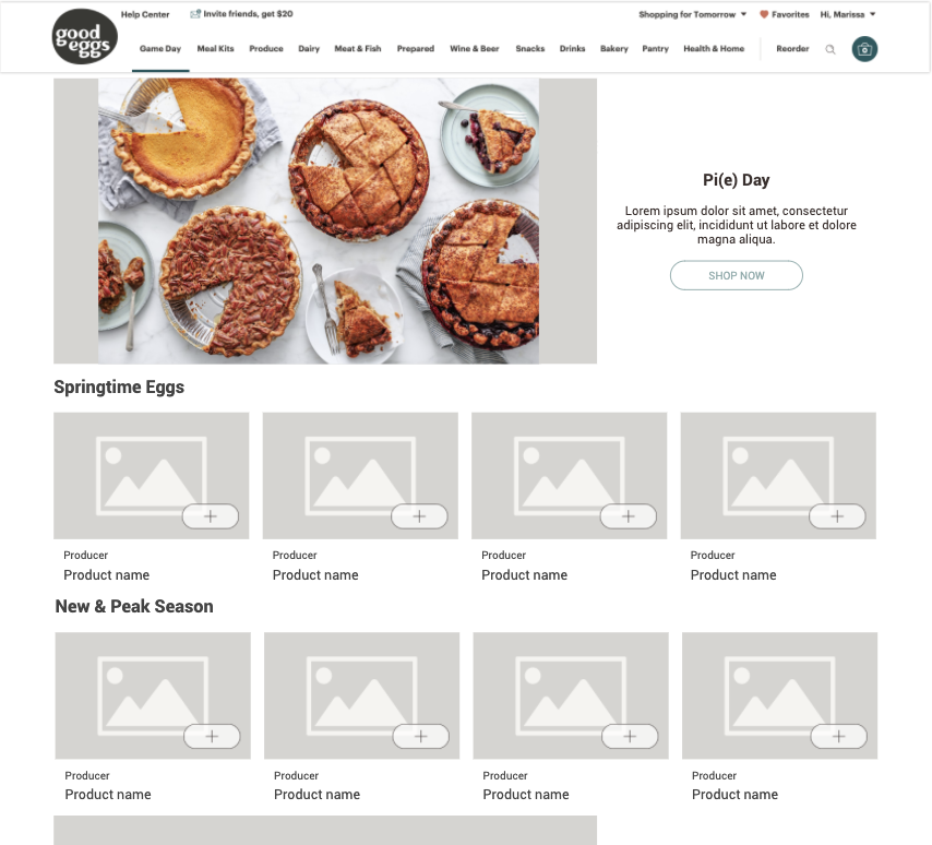
Featured Merch[andising] Story
These modules are made of up an image and content block with button CTA. The full width story (1) is the hero image of the homepage. It is a required block. The second, in-line story (2) is an optional module.
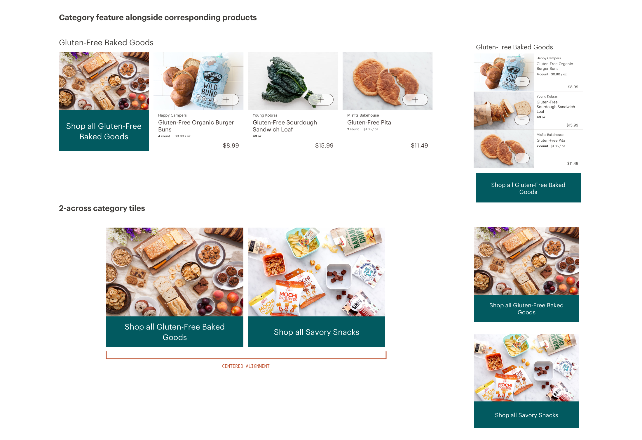
Product Round-Ups
Round-ups are meant to display products grouped together that need little introduction (or description) beyond an optional label and title. More than 4 products can be displayed; carousel controls will appear when needed.

Product Round-Ups with Content Intro
Meant for a roundup of items that need more robust copy intro— like Producer spotlights modules and the 3DK monthly menu—these roundups include a block of in-line copy and accompanying text link.

Group Highlights
Groups are intended to act as an entry point for existing marketplace categories, subcategories, or featured sets .
Two module styles exist:
The second focuses on a single group &/or category and allows products to be highlighted next to the image & CTA.
Displays front doors only. Layout variations are 2 across, 4 across, or stacking those variations to create 2x2 or 4x2.
From the Blog
This module allows blog content to be brought into the shopping experience. It can promote a group of the most recent or most popular posts (1), or feature a single blog post (2), or can make a post shoppable by highlighting associated products (3).

Instagram
A way to highlight our Instagram presence and promote the social content within the shopping experience.

Banners
Banner modules are intended to be a catch-all for all other forms of communication that we might want to bring to the homescreen. Layouts include a single, full-width banner or 2 side-by-side banners. These could be for marketing purposes, referral, special events, etc.

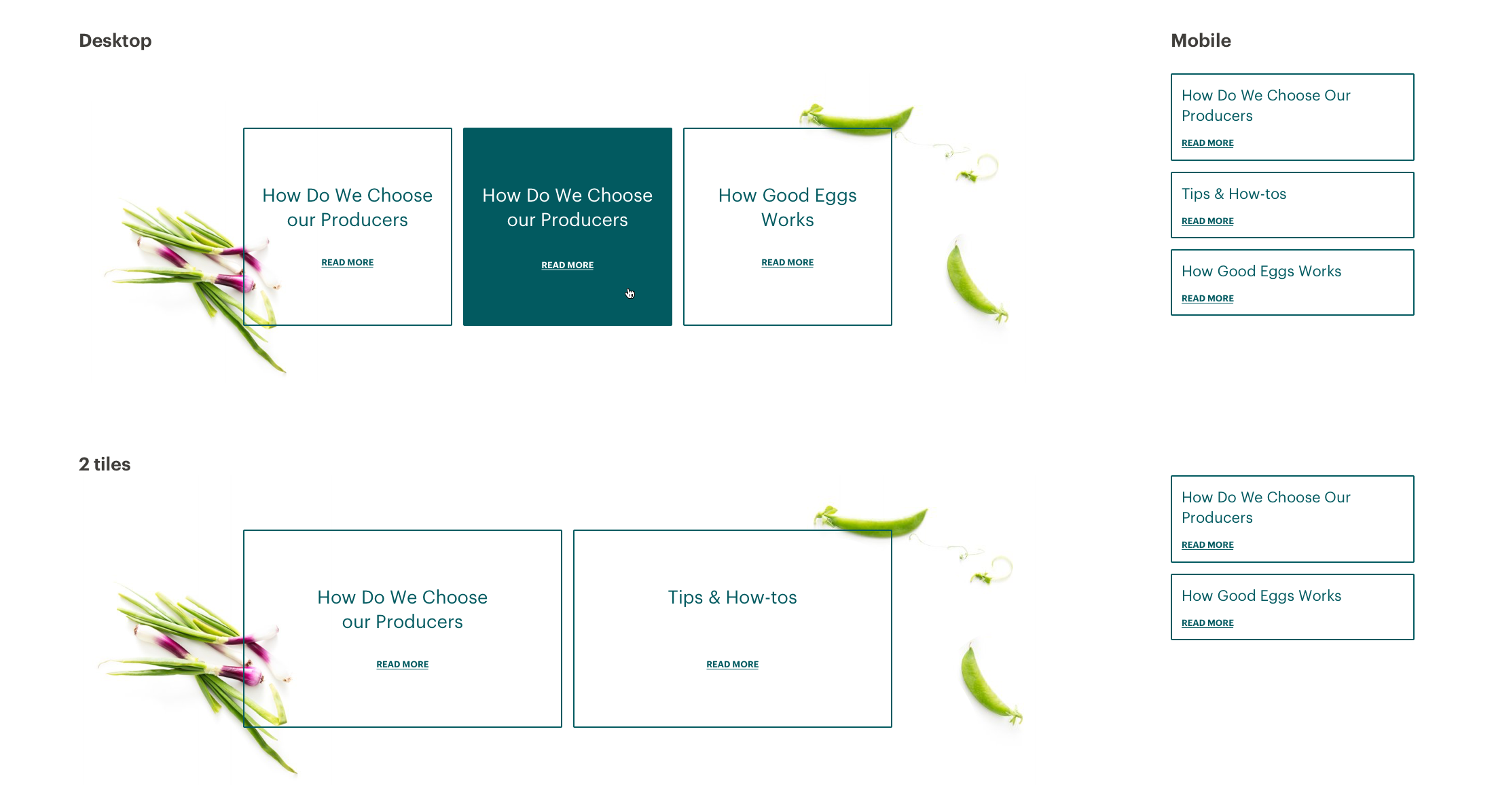
Content Links
These links are intended to answer some of the most often asked questions and bring some of our evergreen content to our front page.
Putting it all together

Additional work
To further support the merchandising team, I also made them wireframing resources in Google Slides so they could plan and layout homepages in advance.
I collaborated with our outside agency to develop a custom plugin for Contentful that allows homepage editors to select product and categories for display. The goal was to require less manual curation and leverage our product data to do a majority of the heavy lifting for maintaining available inventory.
