
A Good Eggs Case Study
Product Detail Pages
Background
Before the Mobile Rebuild was a formal initiative, the Product Manager and myself started re-evaluating the future of our Product Detail Pages (PDPs). Ideally, the PDP represents a single place where a customer can learn and explore everything there is about a particular grocery item or meal kit. For instance, if they want to learn about an obscure piece of produce, like Cherimoya or Watermelon Radish, and how to prepare, cook or be inspired by it, the PDP would be their source for that information. Same with meal kits—ideas around sides, wine pairings, dessert, etc. could live within the same template.
Good Eggs was adopting a new Personal Information Manager (PIM) software and we had a long-term product strategy that presupposed the introduction of new information (nutritional info, updated tags, etc.). Therefore, it was the right time to reconsider the architecture and experience of our PDP template: what we should add, what we should elevate and emphasize, what we should deprioritize or remove. The project considered the template holistically, from both a product data and inspirational content perspective.

The Problem
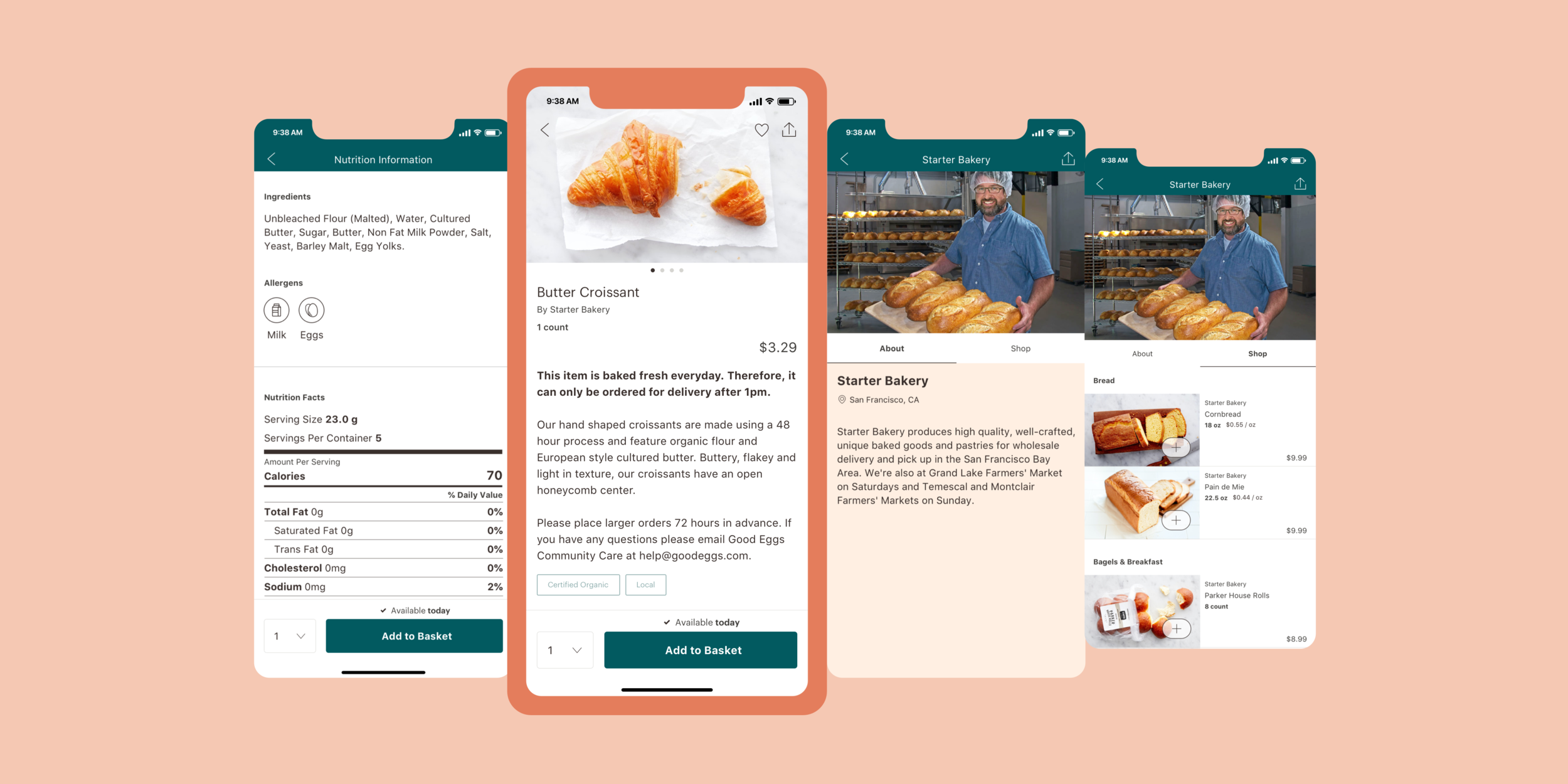
The template for our current PDPs is extremely restrictive. It doesn’t allow us to differentiate product types or easily add new content.

An example of the current product description page for a Butter Croissant across both web & iOS
Project goals
Update the underlying template of the Product Detail Page system to support:
Different product types and their accompanying information; single products, meal kits, 3-dinner kits
Variants (e.g. size, flavor, etc.) One of the quirks of today’s marketplace — a new, separate PDP is used for every size or flavor of an item.
Consistency across web & native
Future personalization; today’s PDPs are a deadend. We do not offer any action or next step beyond adding the item to a user’s basket
The project plan
We kicked off the project with a brief questionnaire we had project stakeholders complete. We gathered their thoughts about a product page’s primary purpose, opportunities, what new information they’d like to see on PDPs, and what they liked or disliked about any competitor product pages.

These insights helped to kick-off my audit of our current pages. I documented all the information we currently displayed, as well as information we wanted to introduce. It helped to identify the elements required for a shared, base template that would work across product types. It also identified data outliers that would be unique to a product type.
I worked on proactively planning for the new data the new PIM would supply, such as nutritional facts & allergens. I also considered other nice-to-have items like social proof; even though it would not be a part of the MVP.
Explorations
The earliest explorations played with product imagery. Unfortunately, we didn’t have a very concrete plan around product imagery. There were no realistic expectations around the maximum number of images I needed to plan for or how many products would actually need more than a single one. This quickly resulted in any layout that relied too heavily on an expected number of images to be nixed.

The earliest explorations were limited to web since the large real estate made content hierarchy the most challenging. We had also been assuming our PDP MVP would launch on web. At around this point the Mobile Rebuild work was gaining traction and it was apparent that the PDP redesign work was a subset of the larger rebuild.
I transitioned to think about the PDP template on our native app experience. Some decisions were easy—like give our gorgeous food photography as much real estate as possible.

Requirements that were explored visually were:
How to support & display more than one product image
How to allow for variant selection (size, flavor, etc.)
Quantity selection
Add to Basket button
Content hierarchy
Visual design of keyword tag component
Header & action styling

Several, late-stage explorations that played around with the location of the Add to Basket button.
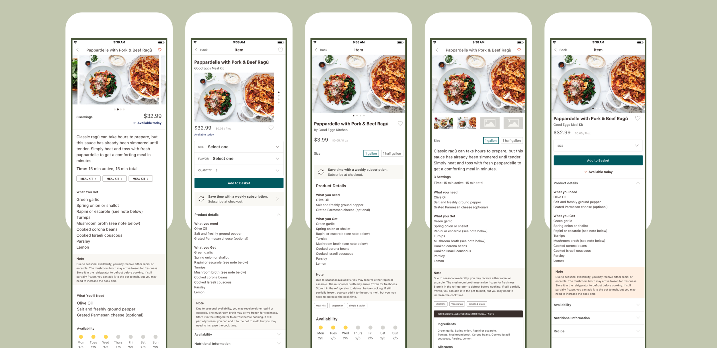
Single Product

A single product’s PDP is made up of product info section, followed by product availability, links to producer info and nutrition information, and highlights similar products at the bottom. I opted to create link-outs to new screens for producer and nutrition information rather than have all the content appear as a long, scrolling page. Introducing the link-out component will also make adding additional content in the future a breeze. If we wanted to incorporate recipe inspiration or ‘How to Prepare’ content? Add a new link!
Meal Kits

While similar in most aspects to the single product PDP, a Meal Kit’s PDP has the addition of a recipe. The ingredients section breaks down what items you’ll be receiving in your kit, along with what basic ingredients you’ll need to have on hand. The recipe is displayed in a tabbed format with ingredients & directions sections broken out. This framework could be repeated on future recipe-only pages offering some continuity.
3-Dinner Kits

The PDP for our 3-Dinner Kit (3DK) diverges the most in content & structure. The 3-Dinner Kit is a set of 3 meal kits, curated each week. The uppermost product info & description section is the same as the other PDP templates, but the page has a unique-to-3DK menu carousel that highlights the current month’s weekly menus. A customer can visit each individual meal kit’s PDP which is slightly abridged from a shoppable Meal Kit PDP. Finally, the screen follows the previously defined link-out structure for a content page that describes how the 3-Dinner Kit service works.

I moved forward with a transparent header on the product image that scrolls into a header bar with visible actions. It allows the product to be the focal point without sacrificing any product information & access to action shortcuts.
The Add to Basket button & quantity selector is sticky to the screen bottom. It allows consistent placement across individual product screens.

Additional content about Nutrition or Producers is accessible through a page link, just below the availability section. This structure allows information to be centralized while also providing a clear future path for the addition of new content to a product page. Likewise, this template framework is conducive to the varying types of products pages.
Edgecases
Templatizing the product pages was a helpful endeavour because product description pages became the base for a few different edgecases. Their adaptability allowed the pages to evolve to meet the various needs of the marketplace.
Meal Kits part of 3-Dinner Kit

A Good Eggs Meal Kit is a bundle of products purchased under a Meal Kit SKU. Therefore, the 3-dinner kit is a bundle of bundles (😀). A customer should be able to explore any of the included kits’ descriptions, or access the ingredients and directions. However, a meal kit that is part of the 3-Dinner Kit is not purchasable on its own and some of it’s information is dictated by its parent SKU.
The original Meal Kit PDP needs only a few revisions to meet the requirements of the 3-Dinner Kit.
The price is removed. The 3-Dinner Kit has a holistic price.
The Availability section is removed. The 3DK has its own availability schedule.
The removal of the Add to Basket button and corresponding quantity selector
Recipes

Recipes are not currently available on the Good Eggs platform but we would like to incorporate them in the future to provide meal planning inspiration. With this in mind I wanted to make sure a recipe fit into the PDP layout to stress the boundaries of the layout & components.
Small tweaks that set the Recipe apart from PDPs are a slightly modified intro section that takes on a more editorial feel. Recipes would be more likely to adopt social proof so I incorporated ratings into my layout test. The Ingredient & Direction tabs lend themselves well to this format and only diverge from Meal Kits in not needing to organize ingredients into “what you get” and “what you need” groupings.
The final way that Recipes depart from the PDP template is in color palette. Across all PDPs the page header is a dark teal. I introduced the idea of giving different content types different header colors to allow a customer to better understand the difference between purchasable products & editorial content.