
A Jupiter case study • 2022
Recipe shopping
The new Jupiter shopping landscape

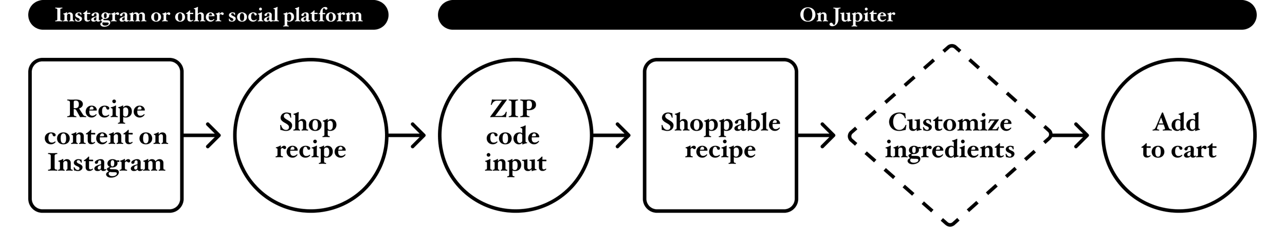
Recipes have always been the core of the Jupiter grocery shopping experience. With one-click you can shop all the ingredients needed to make a recipe.
In late 2021 Jupiter started to lean into the idea of creator recipe content. We welcomed creators onto our platform by incorporating creator-specific stores filled with their recipe content. They earn commission on the sales of their recipes.
Social commerce through recipe content
While stores are discoverable on Jupiter, the most common way customers encounter a creator’s recipe is from social media. Creators post recipe content to their social platforms or blogs and then link to the shoppable recipe on Jupiter. From these links, customers are directed to Jupiter where they input their ZIP code to be matched with local retailer options, shop the recipes, customize ingredients, and check out.
Evolution of the recipe card

The idea of shoppable recipes predated our working with creators. The recipe visual experienced an evolution over the years. We explored the addition of user generated content as demonstrated by the 2021 & 2022 card designs. In 2022, our recipe experience started to diverge as we tested the concept of creator stores. The new recipe card represents a merging of the old & new Jupiter directions into a single shopping experience.
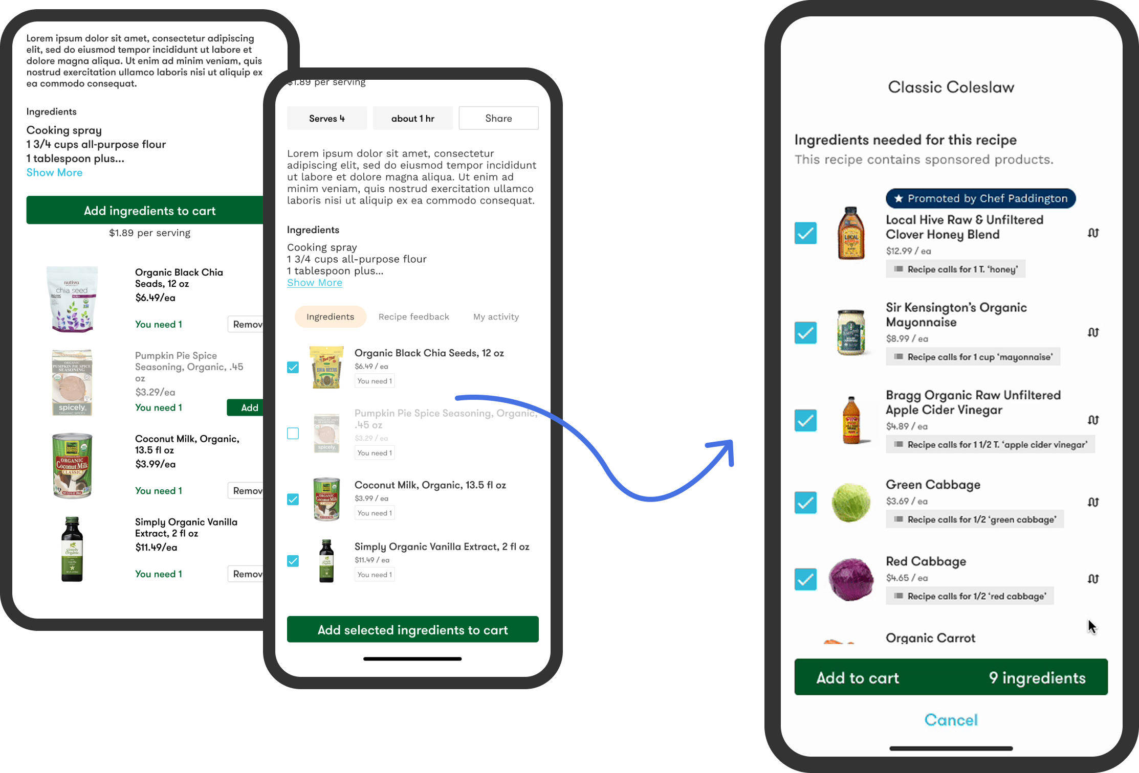
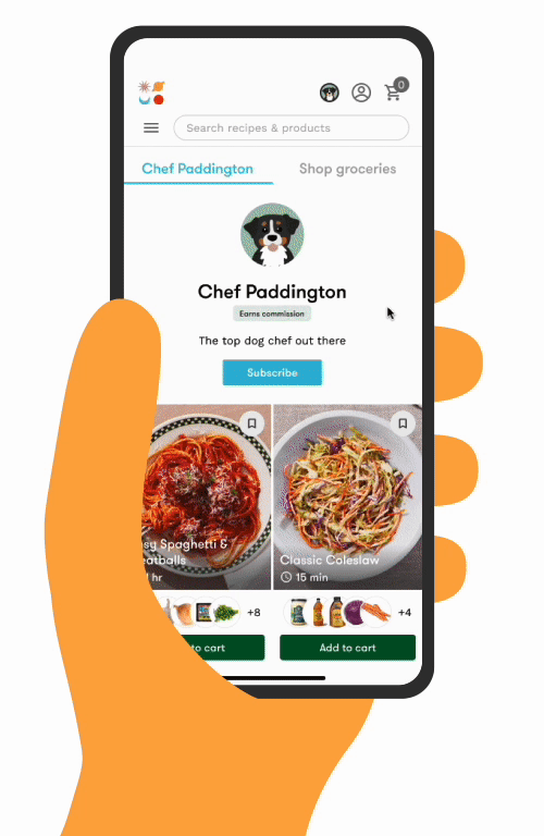
The recipe card is built around the recipe image. It features the recipe title, the recipe creator’s name, cook time, ‘save’ action, a preview of the ingredients included, and lastly, a prominent add to cart button.
We have long struggled with customer’s understanding what exactly they are purchasing when they shop for recipes. We’ve experienced confusion that it is a meal kit or just the digital recipe. Bringing the ingredients to the recipe card was a breakthrough for customer’s understanding it is a bundle of groceries.
Recipe details
The recipe detail screen is accessed by tapping through the recipe card.

Just like the recipe card, the details experience adapted as we tested the idea of creator stores. Today’s version is unified and optimized and takes into account more content variation. Now that our recipes come from creator’s we have less content consistency. The layout needed to be adaptable.

Ideally, the content displayed for each recipe includes serving amount, cook time, description, preview of products selected as ingredients, ingredient amounts, directions, and a link to the original recipe.
Though we can display a recipe’s directions, it is not the norm. Creators prefer that we push traffic to their original recipe source. However, as it becomes common for creators to post only to social media and not have their own blogs, we have the real estate to include text instructions, if needed.
Ingredient customization
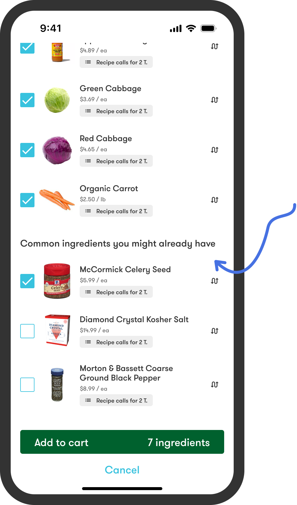
The ingredients are organized into 2 groupings. Items identified as Common ingredients fall to the bottom of the list. These are ingredients a customer is likely to already have on hand, like pantry staples like flour, sugar, salt and spices. Initially, I had these ingredients unselected by default. The assumption was customers were likely to already have them and would accidentally purchase duplicates.
Yet, most of our adds to cart come directly from the recipe card so customers were not seeing the ingredient list. Therefore, customers weren’t understanding why all the ingredients weren’t being added to their cart. While my intention had been to save customers from OVER purchasing ingredients it was having the opposite effect. We adjusted to keep all ingredients selected by default but kept the grouping for easy call-out of items they might NOT want. This immediately resolved the issue.
One of the biggest structural changes made to the details screen was how ingredients were represented. Originally, the ingredients were listed at the bottom of the details screen; now they are displayed on a separate screen accessed from the ‘customize ingredients’ button.
Creator stores
All the shoppable recipes form a creator’s store. Again, though accessible through Jupiter, each creator store exists as its own island with a dedicated URL. Currently, the most common way shoppers land on Jupiter is through recipe content, so we do not see a lot of cross-creator shopping happen. Our customers tend to shop from a single creator store at a time.
MVP
Just like the creator store recipe details, the store was disconnected from the broader Jupiter marketplace.

Today’s version
The new stores integrate the optimized recipe cards, details screen, ingredient customization into a single recipe shopping experience that is adopted & accessible across the entirety of Jupiter.
In 18 months, we launched over 200 individual creator stores and over
100,000 recipes on the platform.
Performance & impact
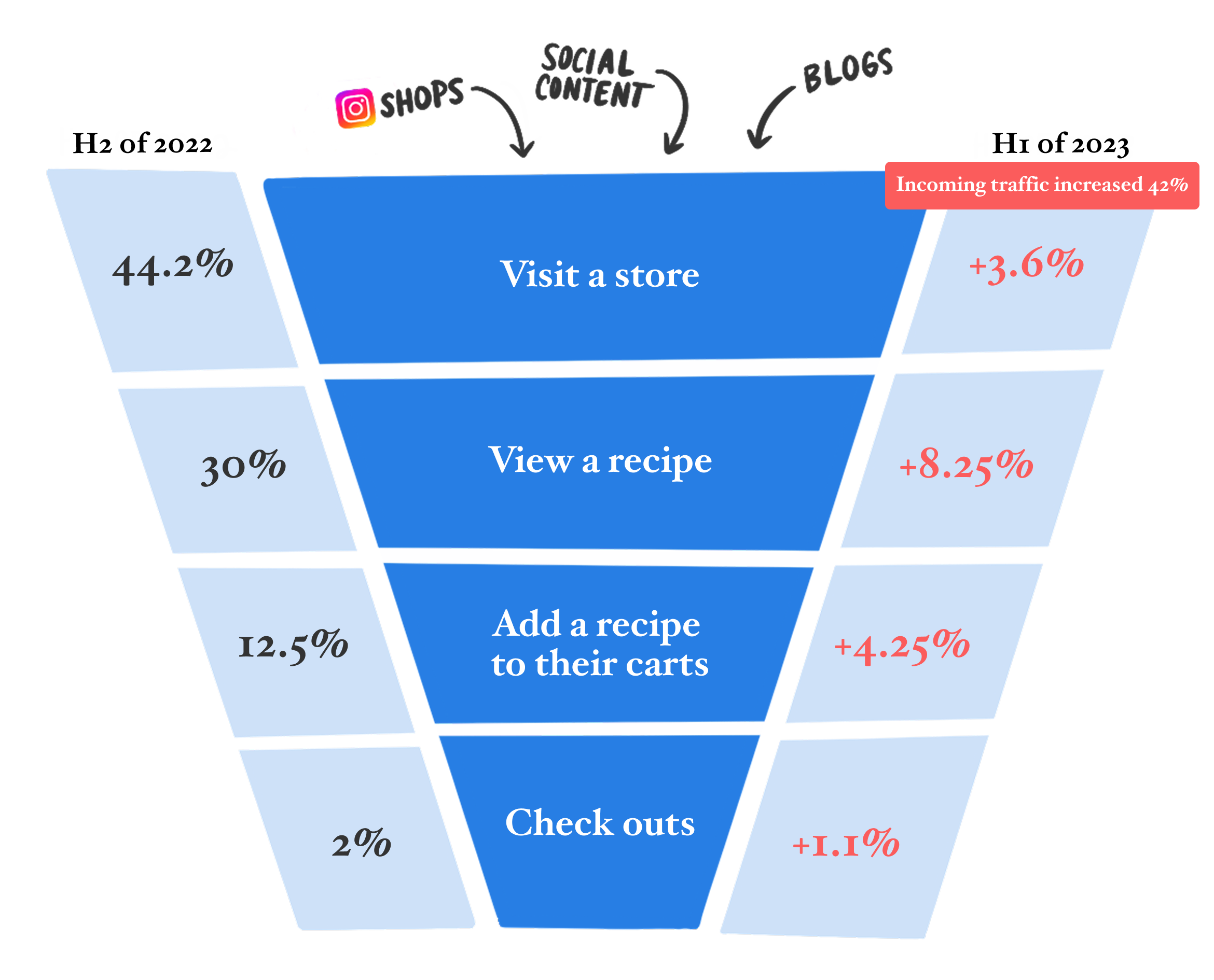
Impact to our shopping funnel
We increased every step of our funnel over 1 year.
Improvements were implemented throughout the last half of 2022. With the help of our increased top of funnel, our shopping metrics saw a 2x increase in adds to cart and checkouts.

Impact to AOV
Across the same time period we have also seen our AOV steadily rise. We have consistently demonstrated that recipe shoppers have a higher AOV on average than grocery-only customers.
How recipe shopping evolved over time

This gives you a better sense of the timeframe where all these changes were happening. We began exploring the idea of creator stores late 2021 / early 2022. We were fully committed to the direction change by mid-year as we moved toward unifying the entirety of our shopping experience. We fully united the 2 experiences at the end of 2022.
What I would do next
Additional information & attributes
The adoption of creator recipe content forced us to strip away a lot of information as we relied on others for content. Now we can start to build the content strategy back up starting with dietary information.
Personalization
Jupiter’s first life was all about customer personalization. The new business direction forced us to prioritize creator and brand needs as we worked to acquire them to the platform. Now we need to figure out how to address customer vs. creator vs. brand wants & needs.
Dive into the next design deep dive —
read about the redesign of Good Eggs’ mobile app.