Redefining our
new user experience
An Academia case study
Optimizing for successful user activation
We wanted to revise our highest traffic acquisition flow to nurture long-term engagement instead of over-indexing on converting visitors into Premium subscribers.
Why this was an important problem to solve
Most Academia visitors visit our platform only once.
This restricts our growth opportunities, as we have a single chance to engage and transact with new users.
Our original sign-up process was optimized to maximize revenue during this one-time interaction, but now we wanted to nurture long-term engagement.
We focused on revising our highest traffic acquisition flow.
The single work page (SWP) is the front door for 86% of Academia’s new user traffic.
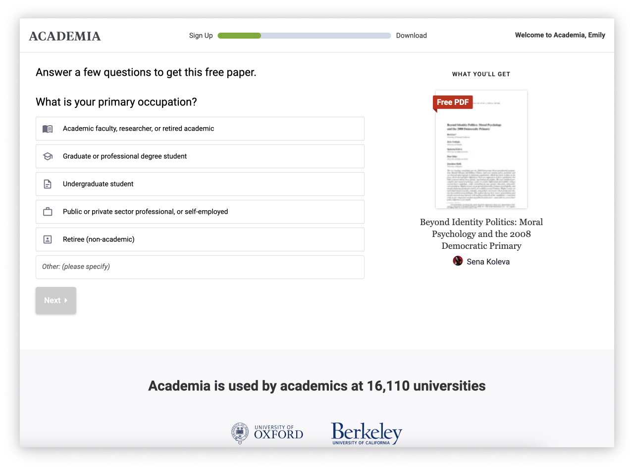
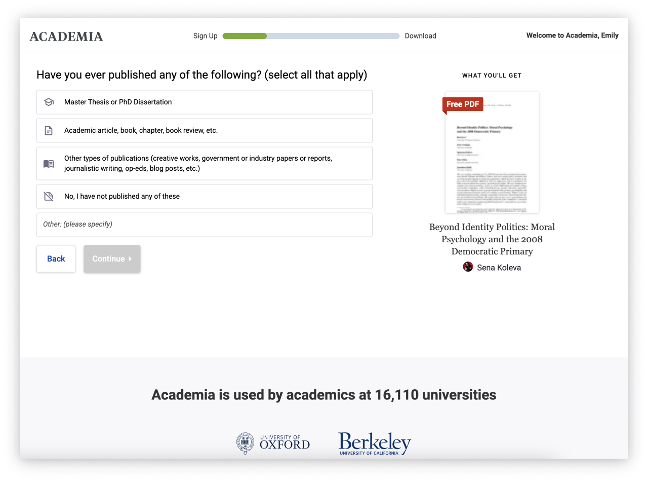
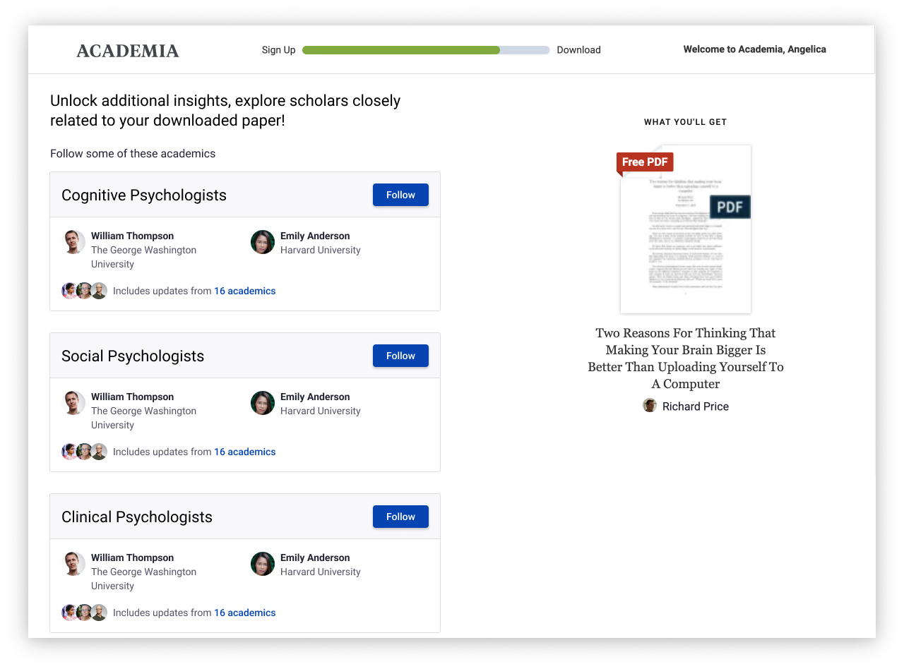
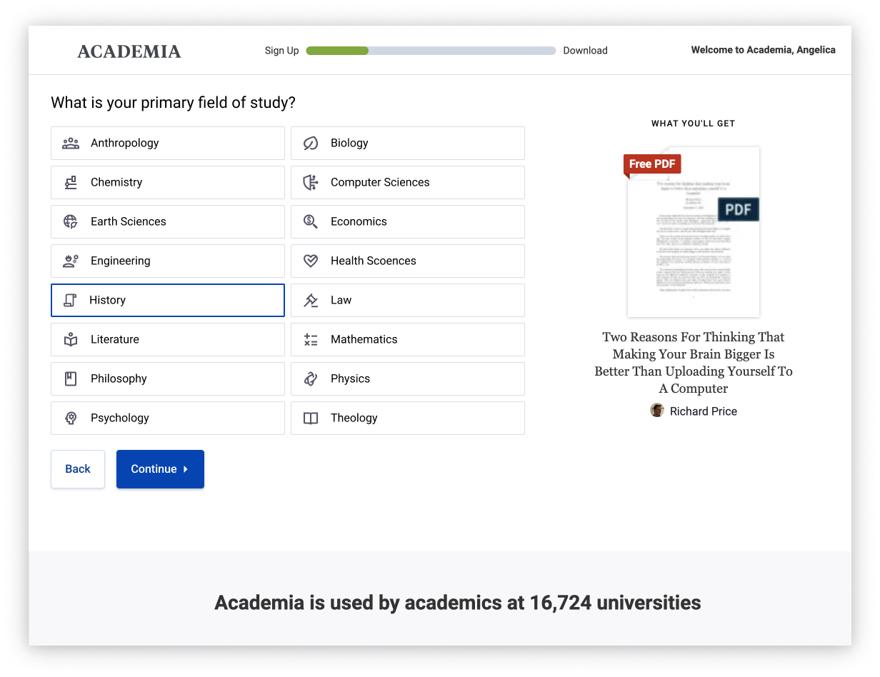
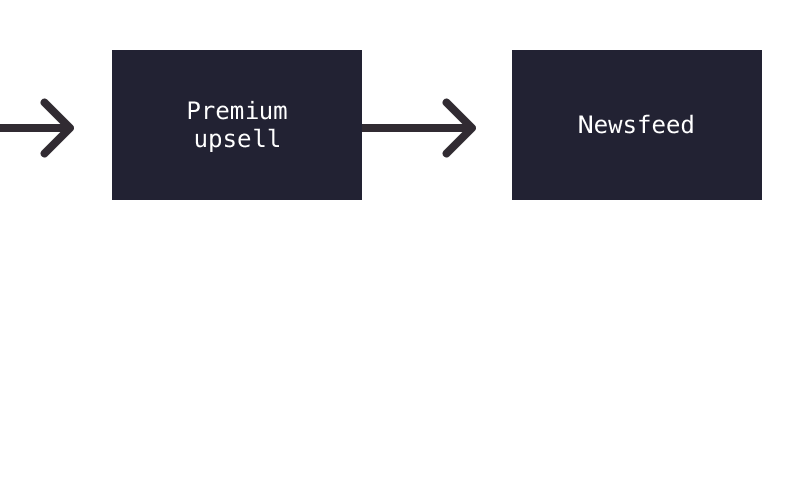
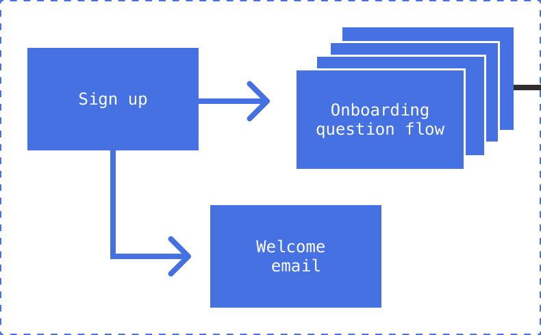
The original new user sign-up and question flow
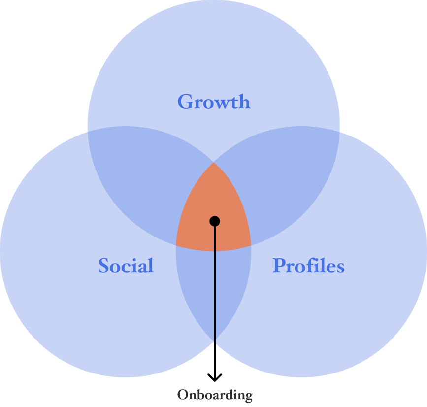
The problems behind the problem
Onboarding did not have a clear product owner
It was one of the most popular channels for product teams to A/B
We were redefining how we measured success
Cross-functional roles,
responsibilities & requirements
Rethinking the new user experience was lead by the Growth team. This included a PM, myself, and 2 engineers.
Growth is responsible for SEO acquisition funnels.
The team’s primary goal is to increase top of funnel traffic and drive more high quality sign-ups.
Profiles is responsible for identifying, collecting, and mapping user data, primarily to connect user names to author information.
The team’s primary goal is optimizing for profile completeness to support Premium business efforts.
Social is responsible for piloting the new Academia social experience.
The team’s primary focus is adoption and engagement for the social newsfeed. Particularly, information that allows the most personalized cold start.
Alignment with stakeholders
Aligning the people
All stakeholders were consulted on PRD & metric re-definition
All stakeholders were involved in project kick-off
Regular check-ins between Growth team and stakeholders
I had regular check-ins with with Social team’s designer
Aligning the work
Defined baseline questions that meet our data requirement needs
Roadmap alignment across teams
Newsfeed changes were out of scope for milestone 1
Consulted past research & tests
Developmental milestones
This work was conceptualized as a multi-milestone set of projects. Milestone 1 would focus on re-establishing the baseline of the Academia new user experience. Larger changes would be reserved for Milestones 2 and 3. Unfortunately, this work was deprioritized before significant progress on Milestone 2 was made.
The design process
For the first milestone we focused on the sign-up / log in modal, onboarding question flow, and welcome email. The upsell and optimizations to the landing experience were deemed out of scope for the first milestone.
The new user experience on Academia
Milestone 1
Landing experience
Part one: improvements to the sign up modal
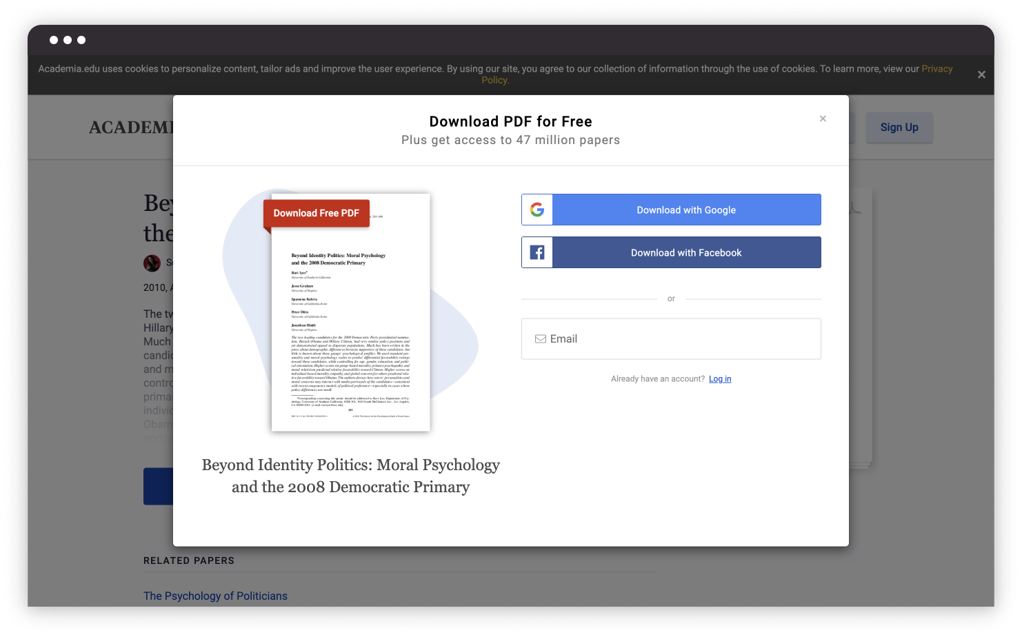
Original sign up modal
Improved sign up modal
The medium-term goal was to establish a single sign-up/log in modal that would be used across the site. Therefore, I opted for a more utilitarian modal layout and surfaced all sign-up options available. My driving hypothesis was that being able to see the paper they are signing up to read / download would be a motivating factor when being faced with account creation.
Merging sign up and log in flows
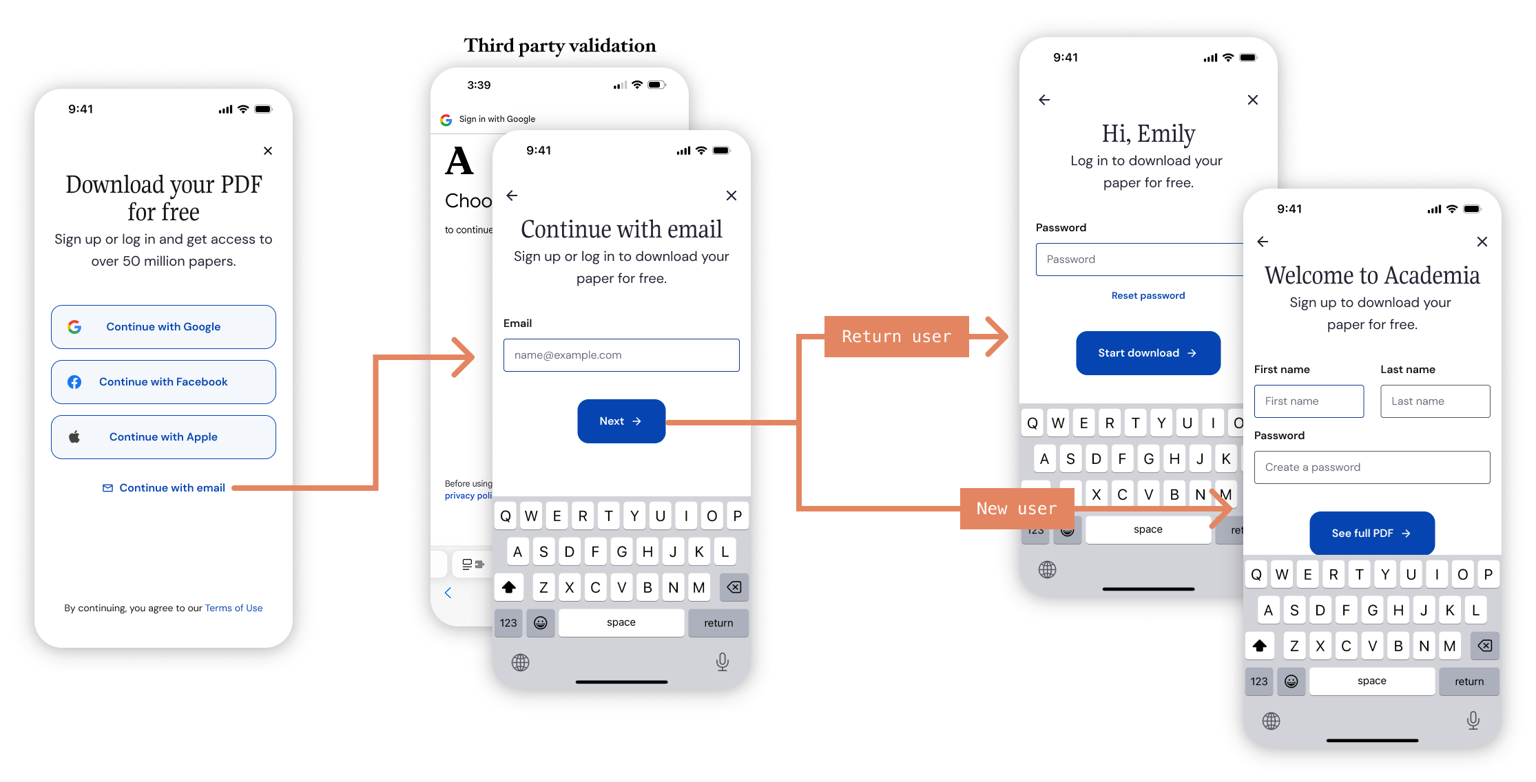
Users would often struggle to remember if they already had an account with Academia. To resolve this common pain point, I merged the sign up and log in flows. We validate the user’s email and guide them to the appropriate next step, sign up or log in.
Follow-up testing: copy & button order
Control
Variant B
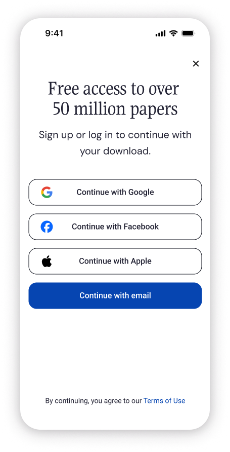
Tested copy variations that led with the value prop rather than the action
Variant C
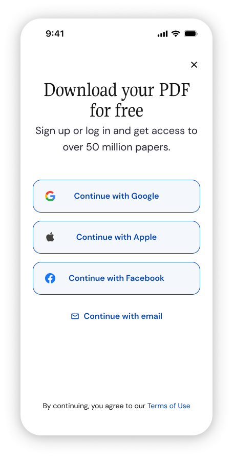
Tested whether the ordering and styling of the buttons could affect selections (answer: yes)
What we accomplished
Sign up modal improvements
+2.7%
Sign ups from logged out single work page
Log ins from logged out single work page
+1.34%
Impact on sign-up once new sign up and onboarding flows were launched
Immediate impact on log ins
Part two: onboarding question flow
Requirements
Require sign-up to view / download paper
Support established baseline questions
Include paper download as part of flow
Keep Premium upsell step post-questionaire
Change landing destination to newsfeed
Incorporate new, ongoing brand direction
Hypotheses
Excessive upselling of Premium subscription is not demonstrating the immediate value of the platform
Single work page is an ineffective destination if we want users to return; newsfeed would be better
Delivering on a user’s job-to-be-done immediately is better than using it as leverage for flow completion
Sharing how we use the data we collect will build trust
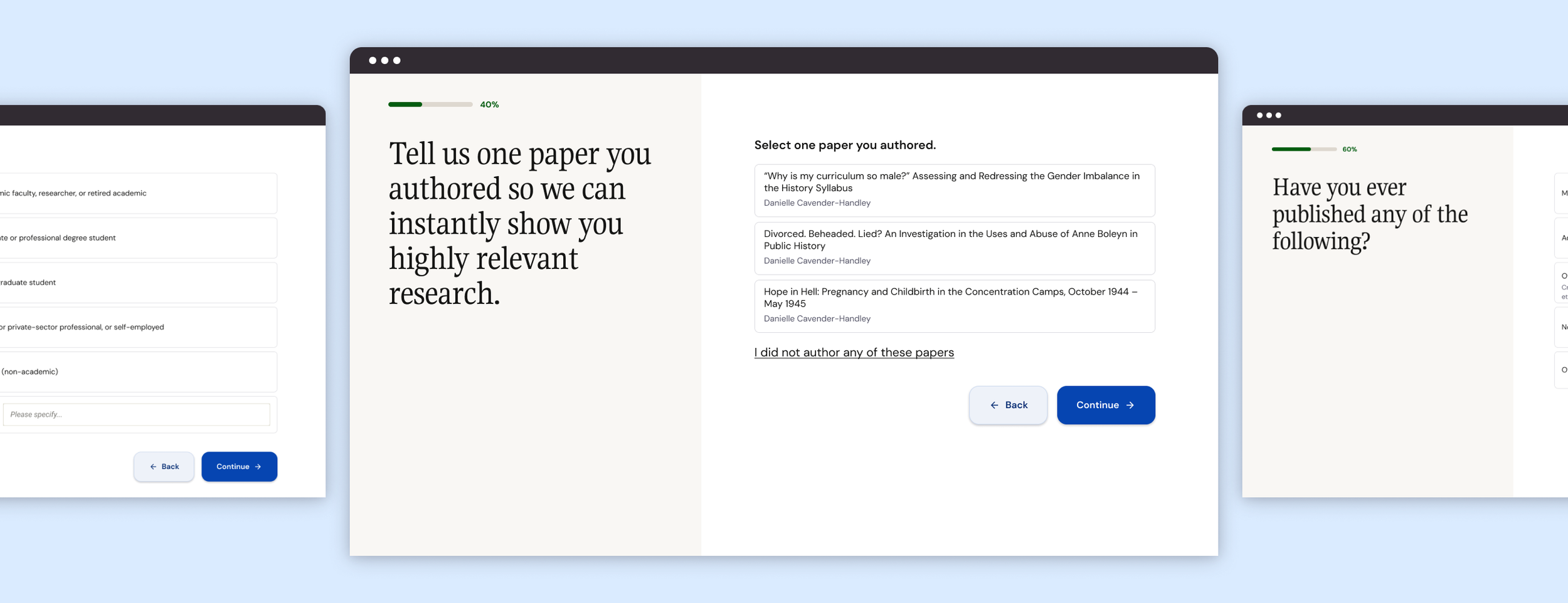
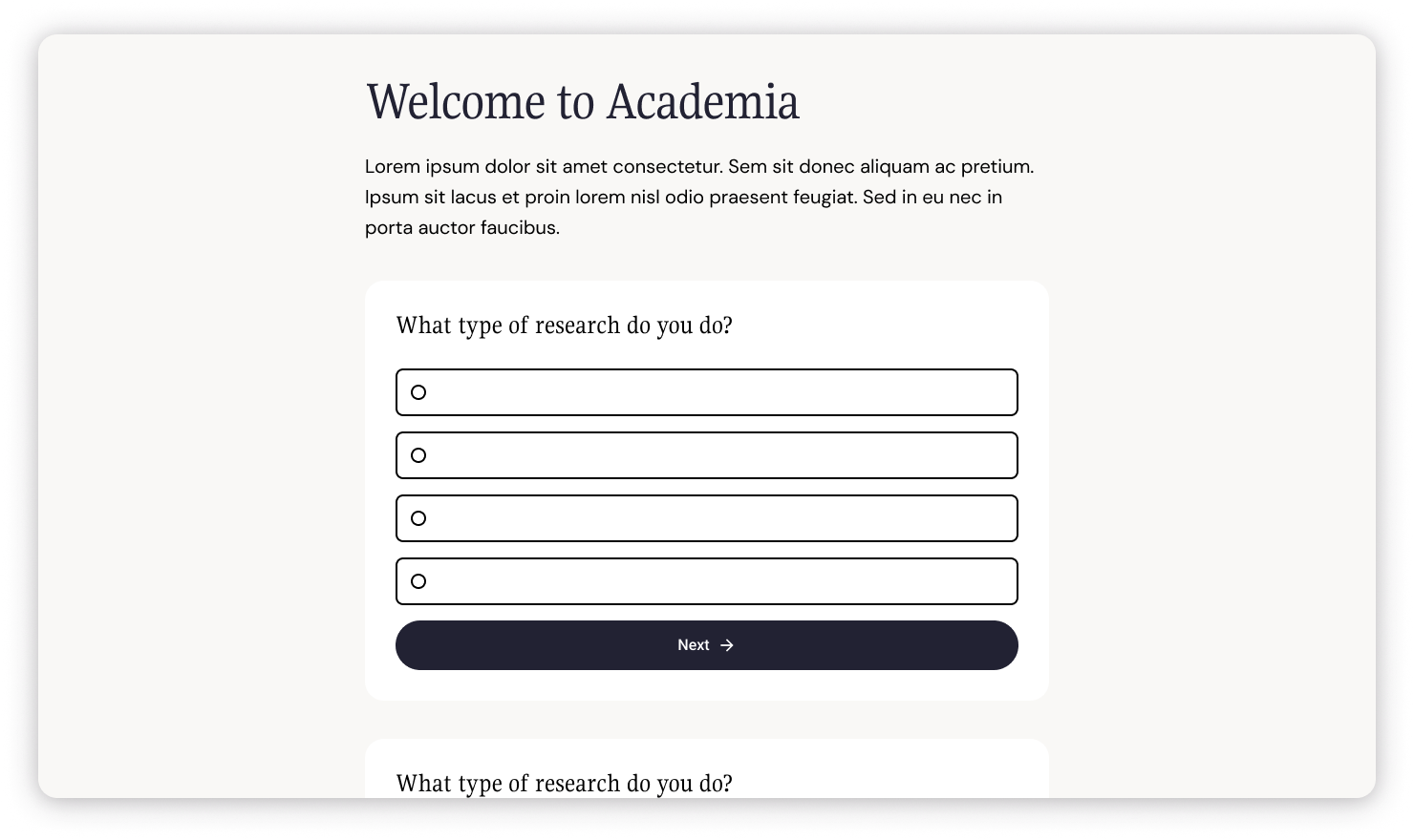
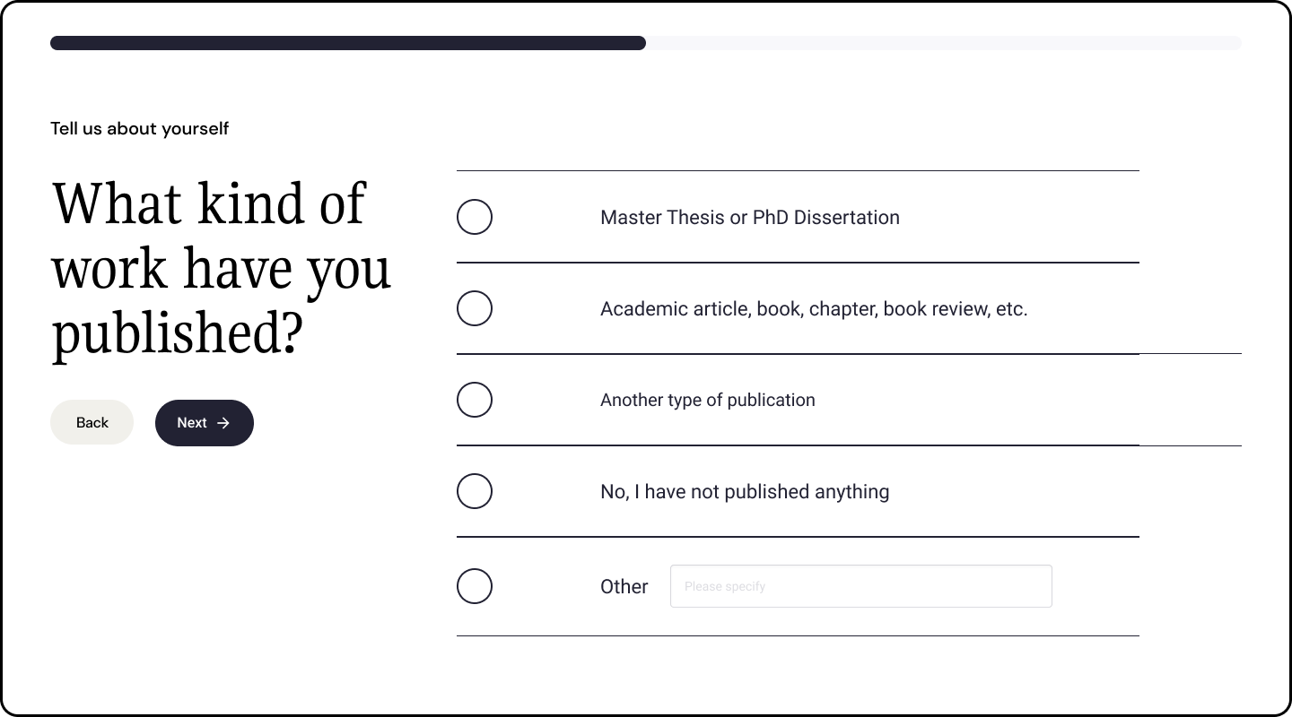
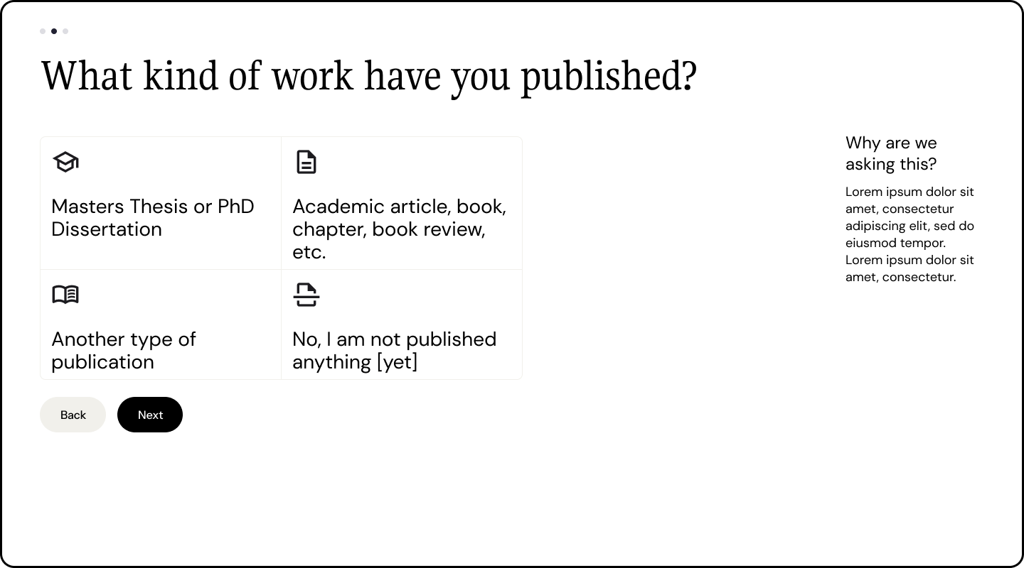
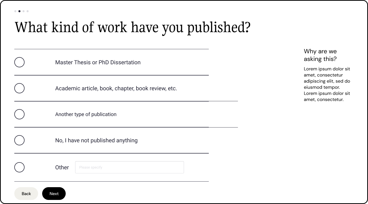
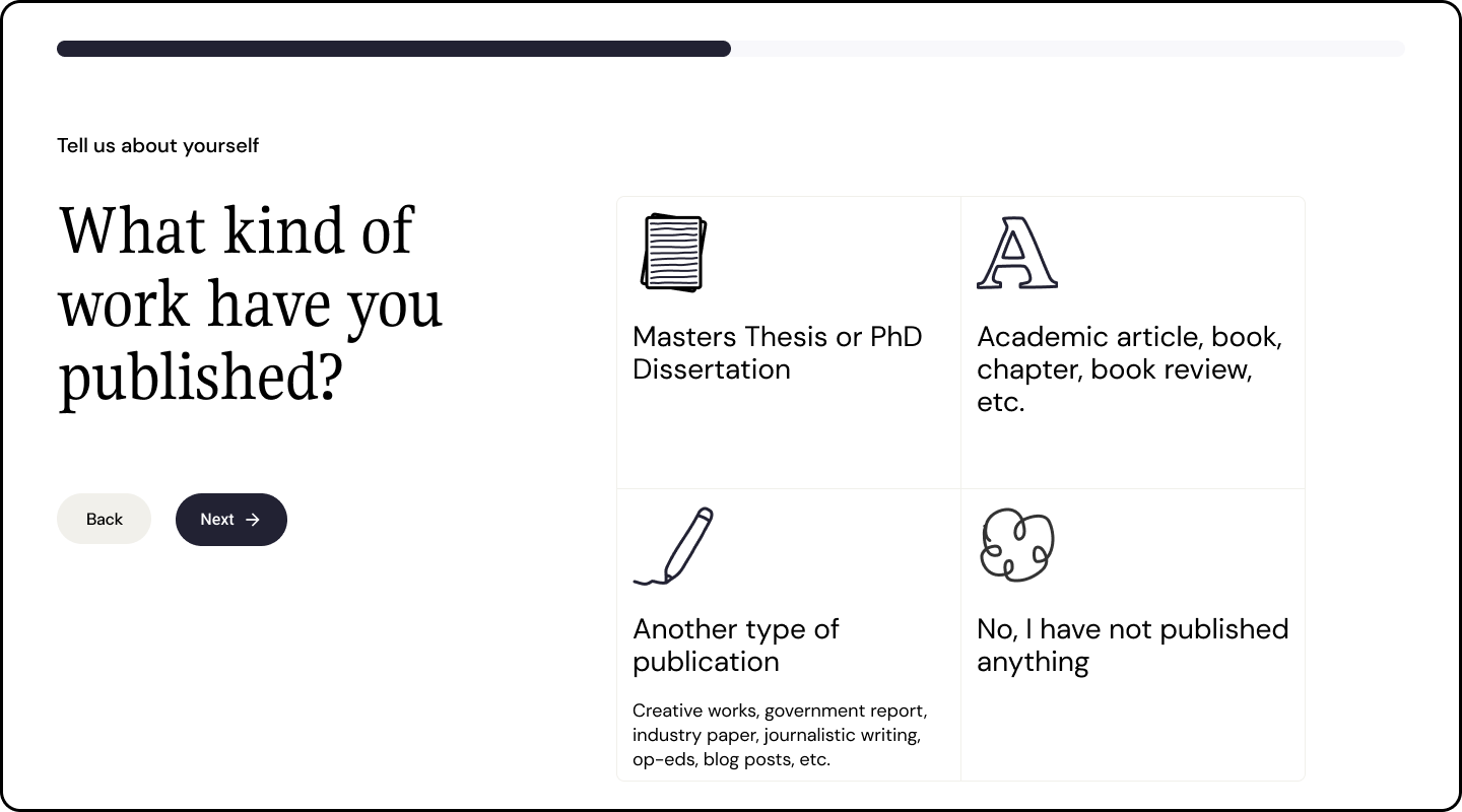
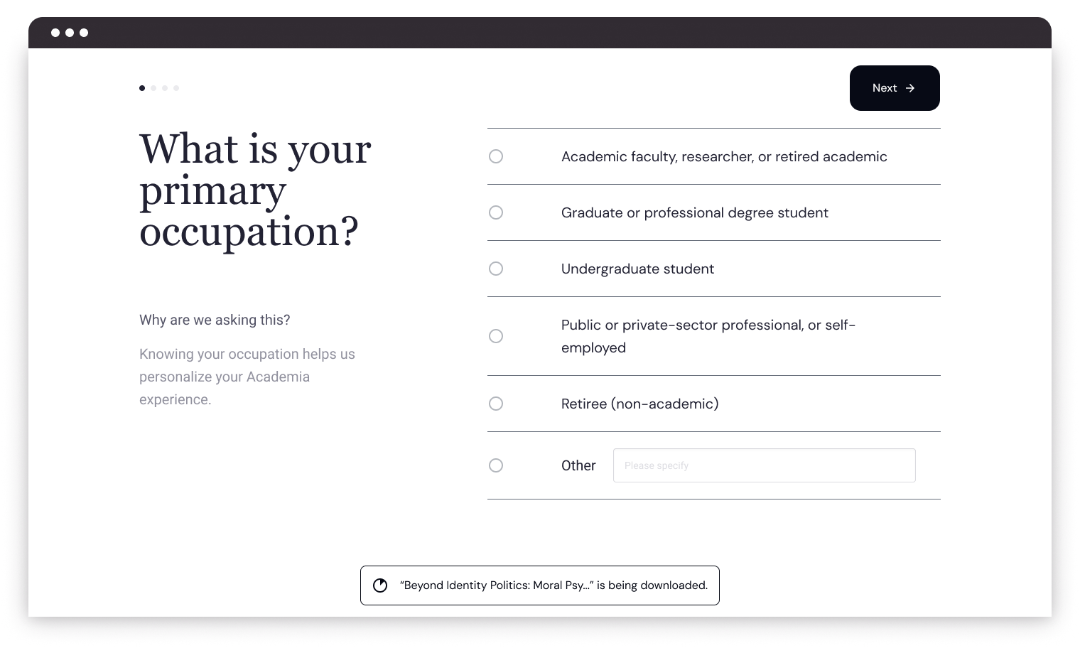
Onboarding structure explorations
Top: Vertical scrolling form
Right: Fullscreen, one-question-at-a-time
Right: Faux-
modal style
Left: Split-screen with space for branding &/or content
Question and answer explorations
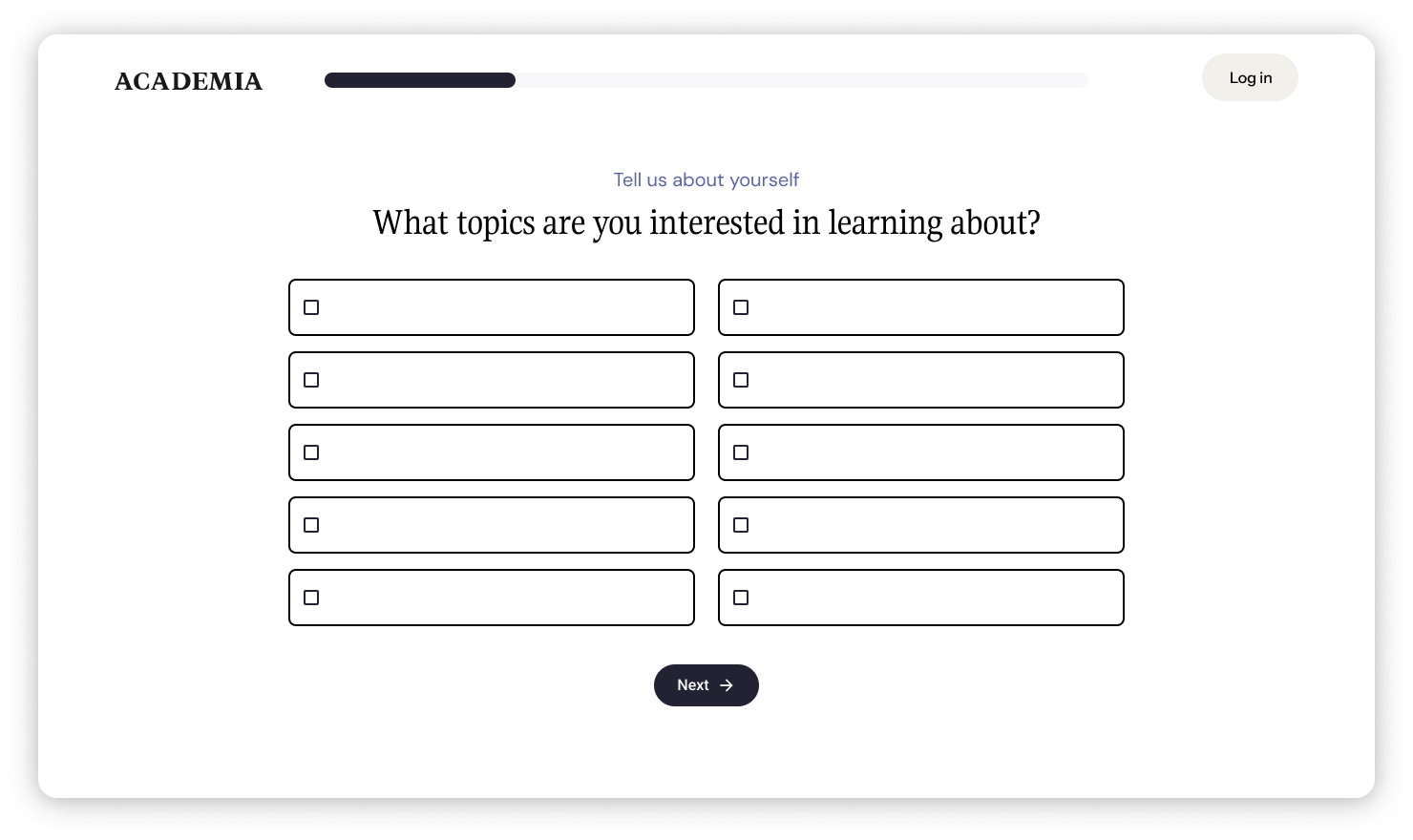
Question styling & layout
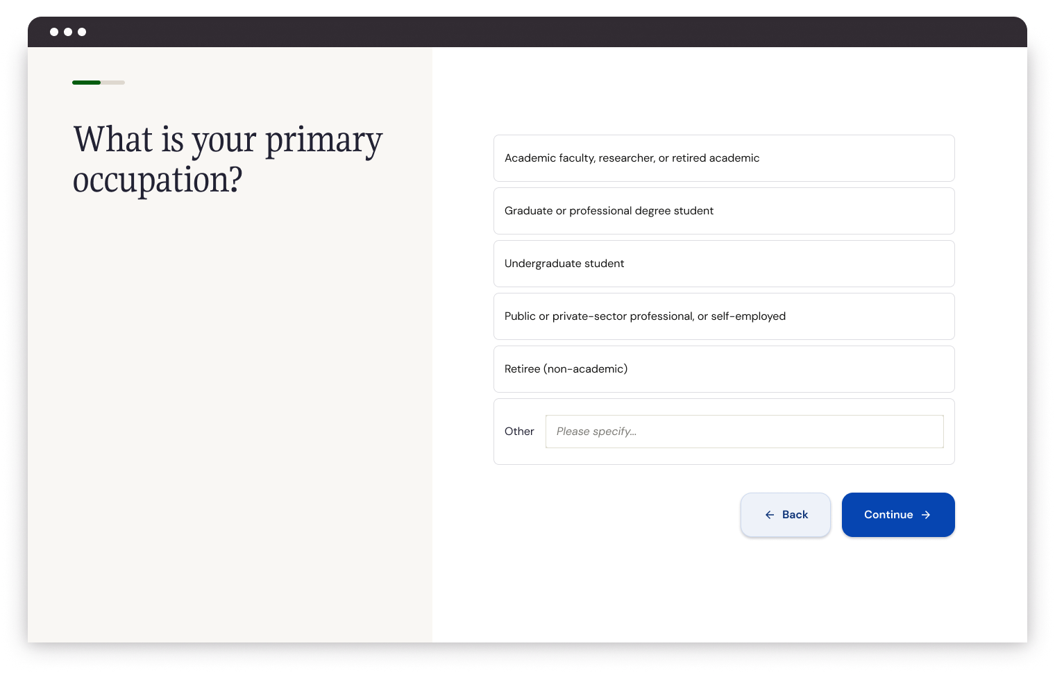
First pass
At the same time, Academia was also undergoing a brand refresh. M1 of onboarding would launch before the new visual direction was fully established. Therefore, I was tasked with creating a visual style in “the spirit of the new branding direction” that could serve as a stopgap.
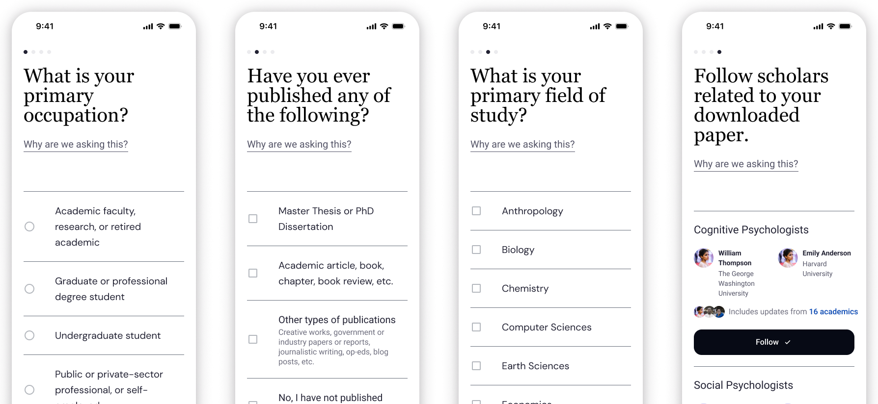
Core question flow
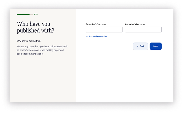
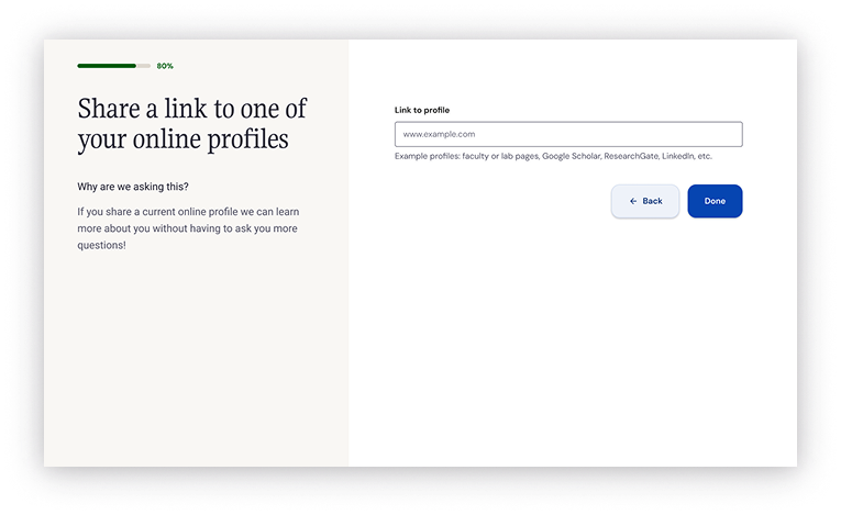
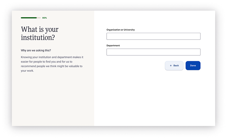
Not only did we support our core, required questions, I included a question currently being A/B tested by the Social team to demonstrate the flexibility of the onboarding system.
Wildcard!
Question styling & layout
Second pass
Styling evolved once the new Brand direction was established. Our color palette expanded, type styles changed, and I tested new answer components.
Iteration & future use
The layout and design were able to support many future questions.
What we accomplished
Onboarding flow metrics
Completion of onboarding flow
Repeat visits
2.5x
+8.4%
Users who returned to the platform within 30 days
Decreased drop-off during question flow significantly!
Upgrades
+2.4%
Upgrades was a do-no-harm metric but the new flow saw a slight increase to Premium upgrades.
Impact on metrics important to other stakeholders
Completion of experience-critical questions
+23.1%
+16.6%
We saw an overall increase on dwell time on the social feed
Authorship question
User role question
Time on page
+2m 34s
Part three: Redesigning our welcome email
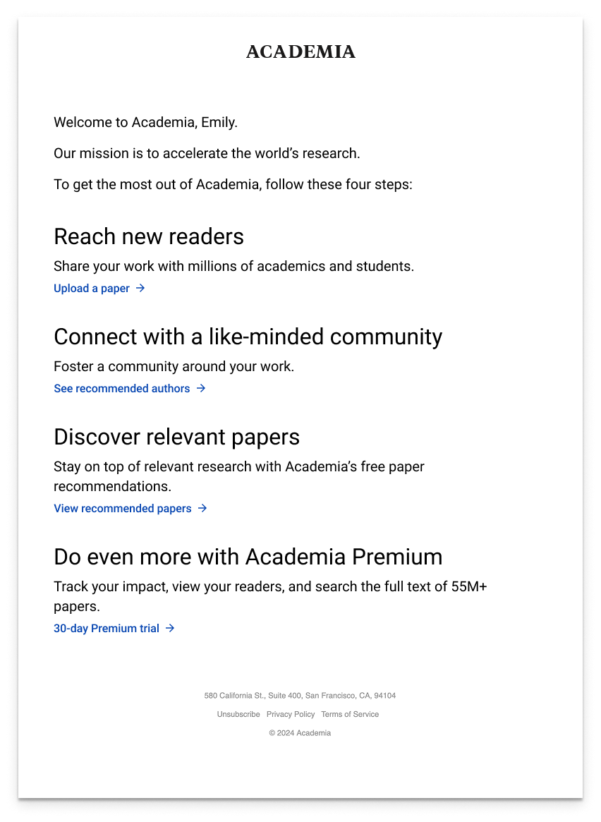
The original welcome email
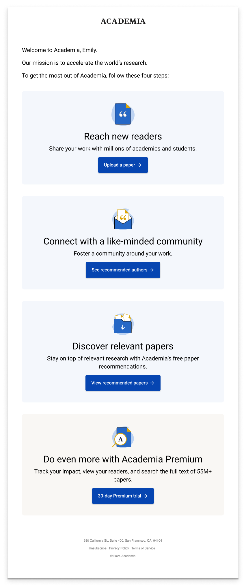
I designed a goldilocks set of emails to test our approach to content and styling.
Variant 3
Variant 1
Variant 2
Winning email variant
Variant 2
+$.112
CTR
7.64%
Revenue / user
Versus control’s +$.109
Versus control’s 4.75%
What would I do differently?
The original plan was milestone-based, we never made it to milestone 2
Think bigger
At Academia there are many strongly held beliefs that are unshakeable
Dig deeper into our assumptions
More ‘download’ location testing
We only tested a single change to the moment of download
Focus on the breadth of questions from the get-go
Rather than limiting myself to the baseline questions, I think proactively proving the flexibility of the proposed system would have gone a long way in calming stakeholder concerns

