
UX changes
Adopting components and type styles was one fix I addressed when I joined the project. The proof of concept hadn’t prioritized being on-brand. A smaller detail I fixed across the Grants experience was aligning the capitalization strategy to our brand guidelines.
Breadcrumb navigation continued into the outline, showing users where they were in the tool flow.
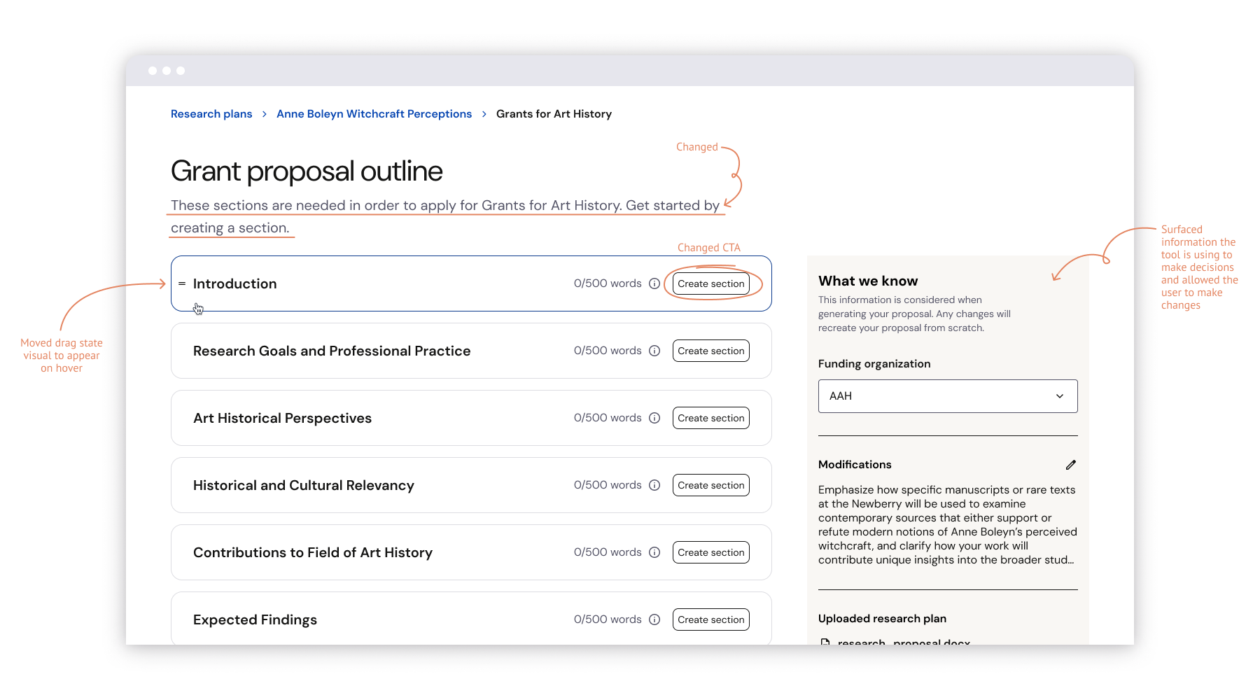
For each section, I maintained the re-order functionality but moved the drag state to appear on hover. It allowed us to prioritize showing other information at the top level and reinforce the idea that we were suggesting this section order because it aligned with the grant proposal documentation.
The largest change was surfacing all of the information we were using to build the proposal in a sidebar. Everything listed has been previously seen or selected by the user. My thinking was, this is the time these items are being put to use; it provides important context for the content generated during this step.
Copy changes
Originally, the main action a user took from a match card was ‘Generate proposal.’ This wasn’t quite accurate because the next step was the outline where the user moves section-by-section, generating the actual content. I changed the action to ‘Build my proposal’ to set expectations.
I rewrote the subhead copy to be more descriptive, rather than just outlining the expected action.
Throughout the experience, the wording ‘generate’ was heavily seen to hammer home that the tool was AI-powered. I dialed that back and opted for more human-sounding language.