
UX changes
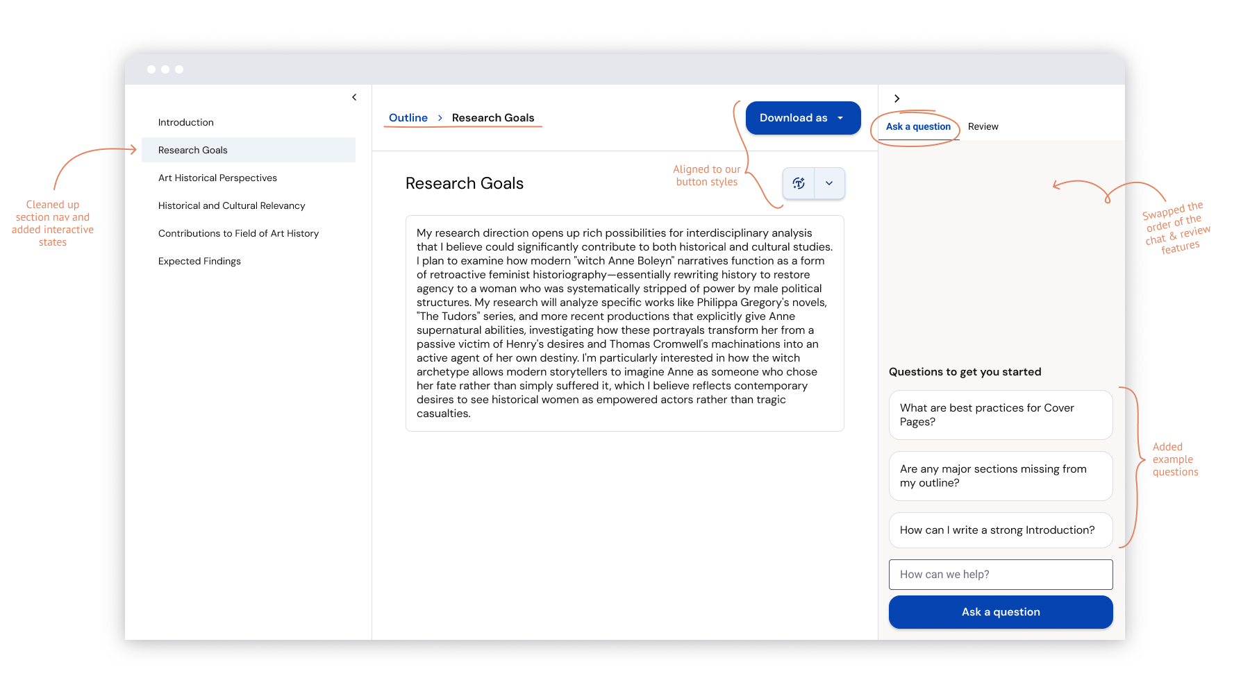
The section navigation was updated with proper interactive states.
I shifted the layout to align to our grid and updated the buttons to represent the proper styling.
The writer already had a breadcrumb navigation, but I adapted it to the same component used in previous steps.
I distinguished the right sidebar from the rest of the content by giving it a background color. Then, swapped the order of the chat and review features because the chat was more useful during the writing process, while the review was intended to be run when writing was complete.
I also added the ability to collapse either sidebar to give the writing panel more space if a user wants focus mode.
Copy changes
The original name and explanation in the “guidance” tab were clunky and hard to differentiate from the chat. We tested several alternatives, like Review and Areas for improvement. Ultimately, the feature itself was stripped out of the writing step.
I changed the original “chat” name to be less literal and more action-oriented. I framed it as Ask a question and surfaced example questions in the empty state.