
Establishing Academia’s first design system that unified a fragmented component landscape
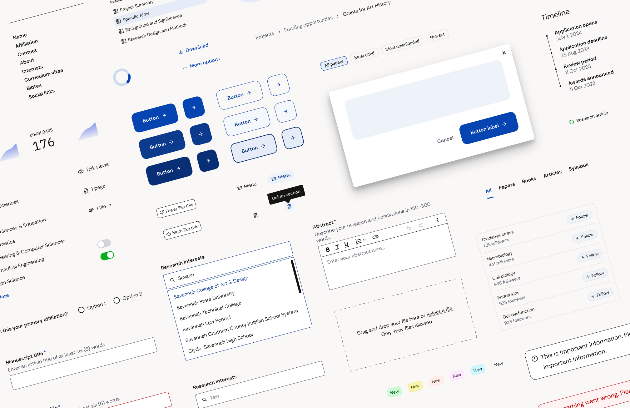
I built and governed a comprehensive system of design tokens, components, and scalable patterns that drove measurable lift during our new brand rollout.
60-second summary
The problem
The lack of a comprehensive design system had created a disjointed product experience. Individual teams were forced to create their own processes and component libraries. These diverging sets of decisions were becoming apparent in the Academia UI.
There had been previous attempts to create and adopt various pieces of a design system. My cross functional investigations unearthed a deep fear that yet another effort would be abandoned partially complete. This learning helped me to tailor my approach to reduce concerns that we could repeat former mistakes.

Key decisions
I prioritized any work that did not require buy-in or additional resources, like auditing and consolidating legacy UI components, adding design variables to Figma, and changing the designer handoff process to incorporate component-specific call-outs.
I had strong support within my immediate product team and was able to stress test ideas at a small scale before I proposed broader roll-outs.
I gathered engineering allies to help tackle small improvements so we could quickly demonstrate value.

My role
My work on the Academia design system began as a side project. I identified the need for a holistic design system, audited and created the first global component library, and established and built out design variables in Figma.
Later on, I formally took over maintaining and scaling the design system.
Once the new brand expression was incorporated into the system, I worked with two engineers and the Head of Design to run an A/B test quantifying the impact of the design changes.
Impact
The infrastructure of the design system was established just as Academia underwent a brand refresh. The system was able to successfully absorb and help transition the UI to use the new color palette, typography, and changes to component styling.
The new styling A/B test ran on the our highest value pages, the single work page, showed an increase in paper downloads, impressions, and overall conversion.
Overall, implementation speed was improved as teams were able to reuse more and more components.

This is where we started…
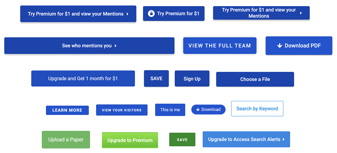
We had a component library* but no design system. Each team had its own unique component library, which resulted in many inconsistencies.
*debatable
The plan & process
It was important to build components and a system to absorb ongoing changes. I began building while a parallel rebrand exercise was kicking off, so I knew incorporating a new brand direction was in our future.
How I planned for future changes
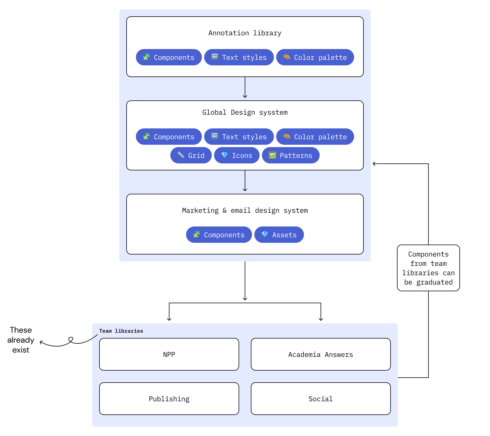
Got ahead of file bloat by creating a multi-library system
Used clear, semantic naming
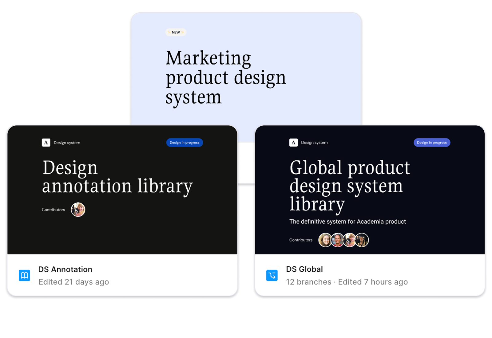


Tied type styles to tokens
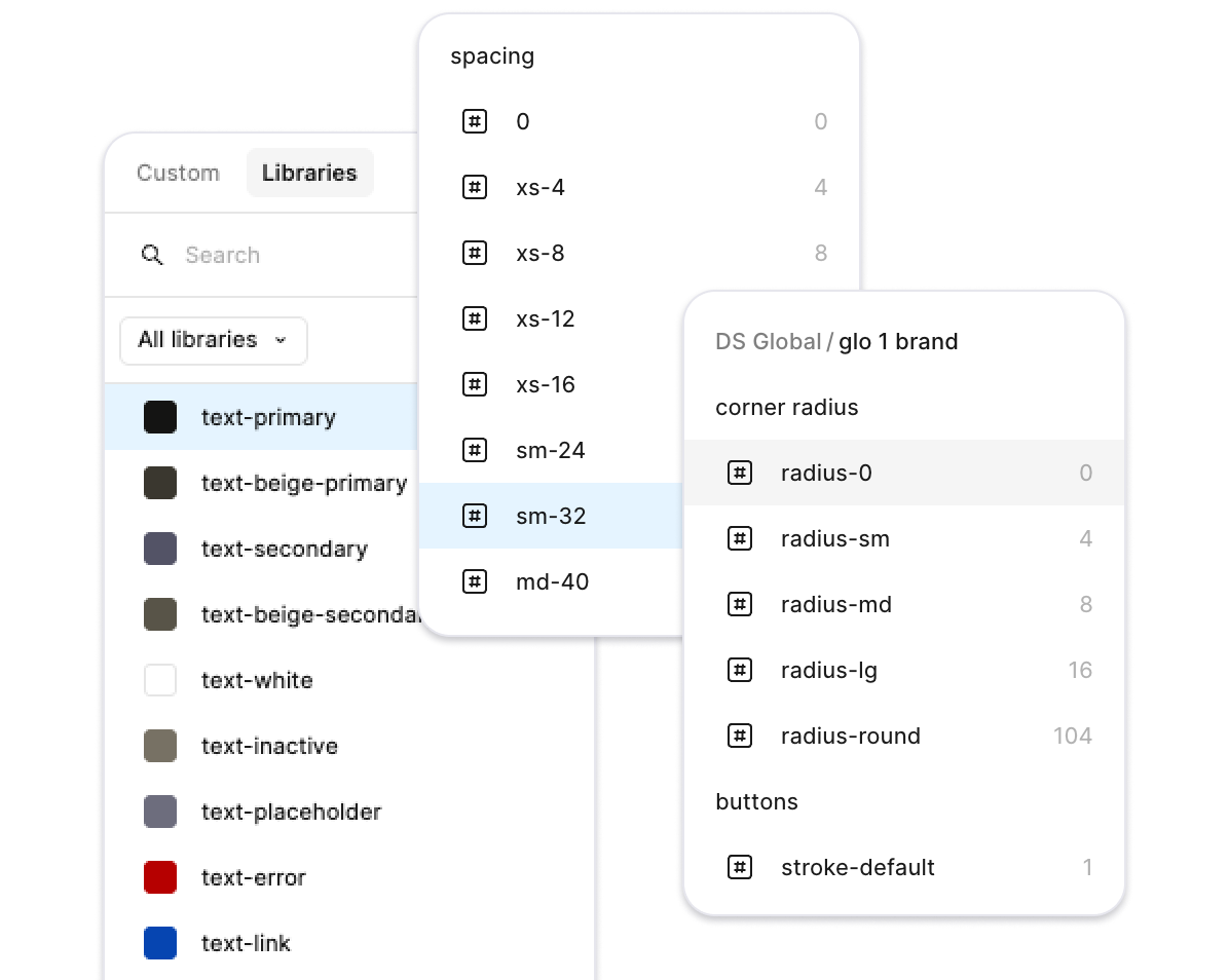
Relied on design tokens as much as possible
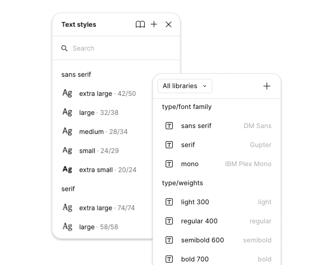
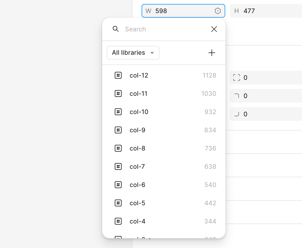


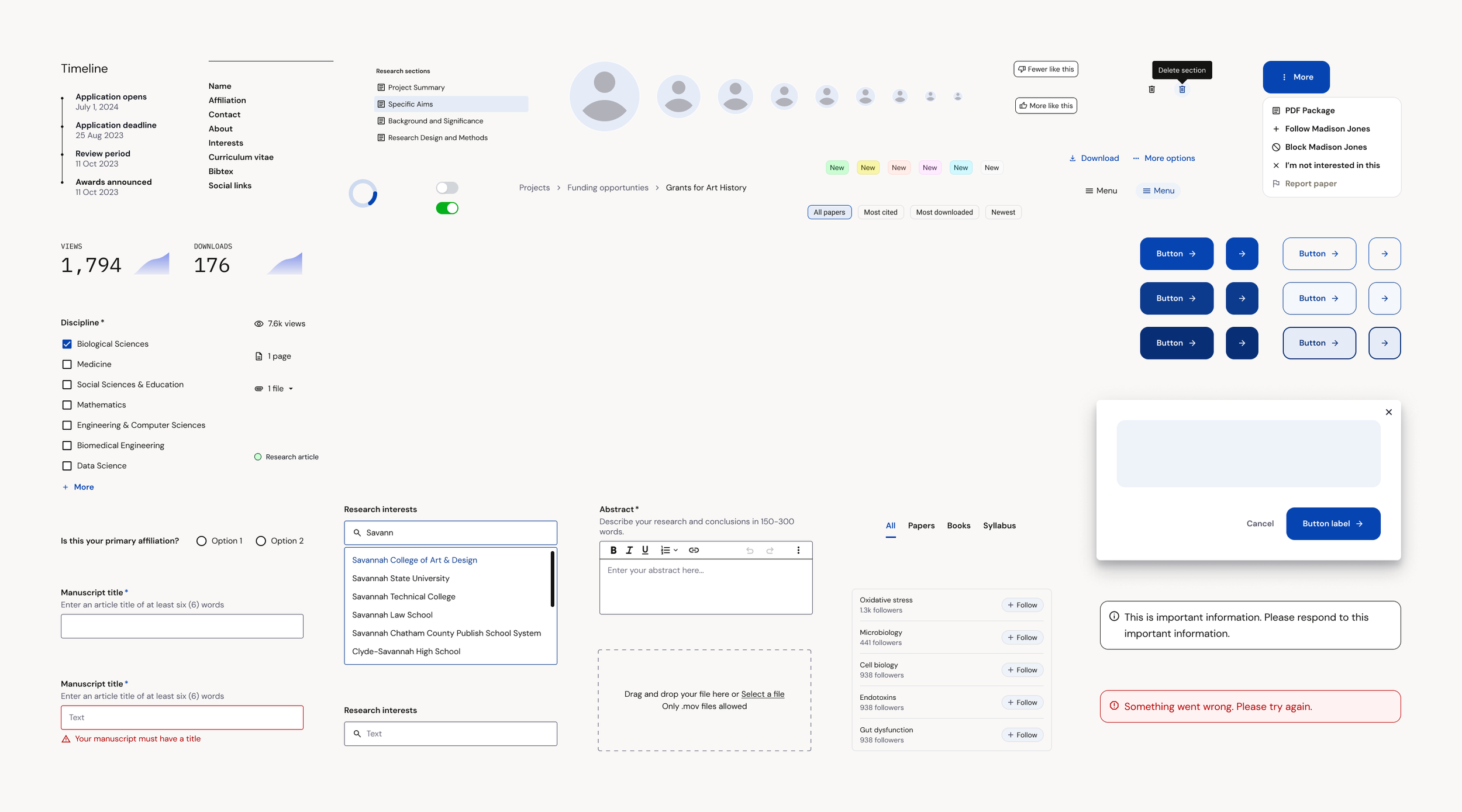
The Academia design system has 200+ components & 278 tokens.
Rules & structure
A guiding principle for the design system was to minimize friction.
At Academia, individual teams have specialized component needs. Instead of requiring our global design system to house all components, we limit it to flexible components used across our product experience.
This allows each product designer to keep and manage their product team’s distinct component library.
When a component’s use expands beyond a single product, it gets “graduated” to the global design system.

Roles & responsibilities
Design system governance

We are a small team of 3-5 designers

I manage the design system and act as point person for component and system-level changes.
I partner with engineering for technical requirements and work with any engineer who is building a component into Storybook.

Any member of the team is free to make updates, component requests, or new components. They just must follow documentation and change-log requirements.

I worked with our Brand Designer to create separate Marketing & Email libraries. I offer file and component support but he is the point person for all Marketing decisions.
Design variables & tokens
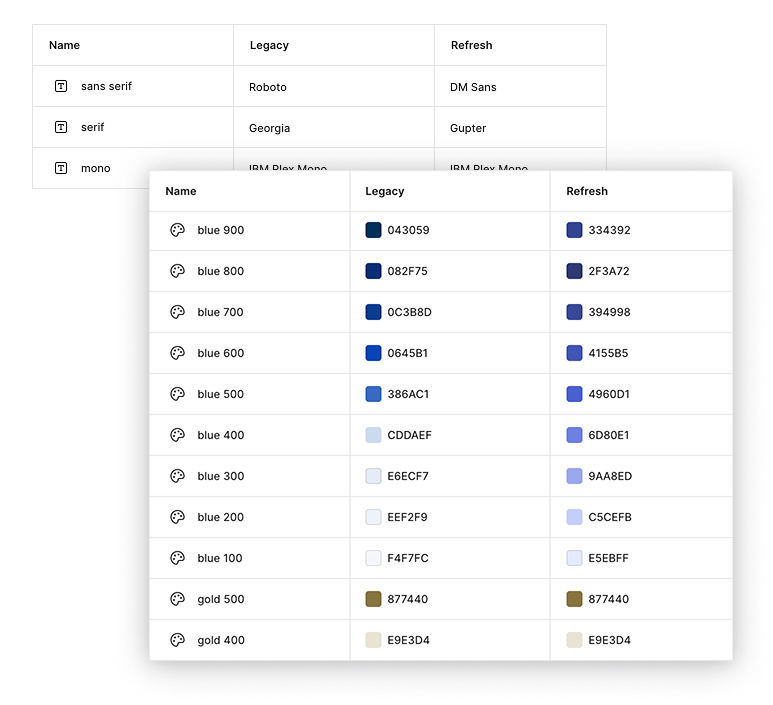
I led the implementation of design variables into our system. They proved invaluable during our brand redesign.
We maintained parallel collections representing both the legacy and refreshed design variables. This allowed designers to design features in either (or both) styles with zero extra work.
This culminated in the ability to transition our entire component library through a single change with zero disruption to ongoing projects.
Data-driven design validation
We A/B tested our highest-revenue pages to gain a detailed understanding of the effect of our changes.
One of the pages we tested was the logged-in version of our single work page.
A/B test results
Winner vs. control
Increase in paper downloads
Boost in content impressions
+5.68%
+4.5%
+1.5%
Improvement in Premium conversions
Control
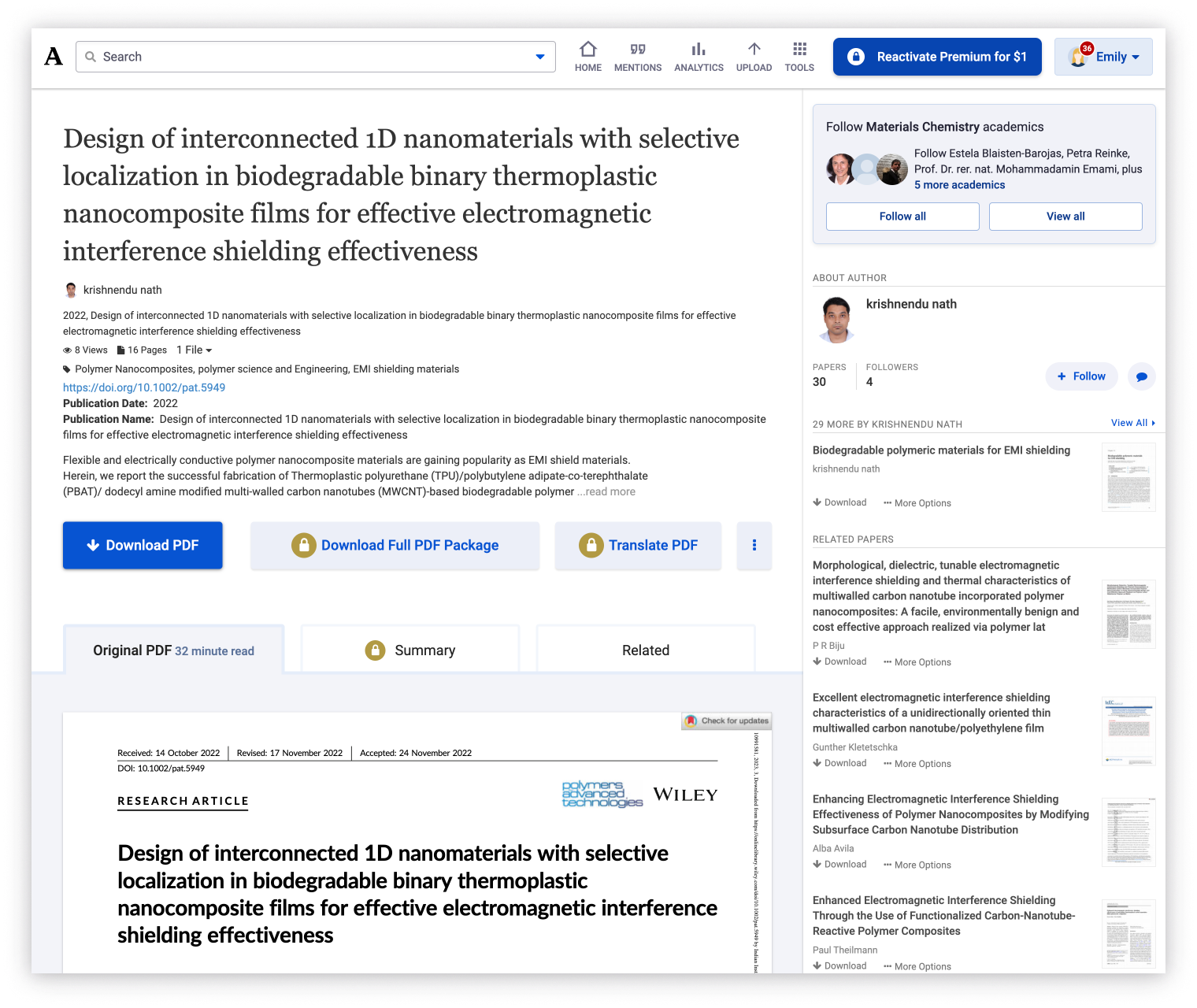
Represented our legacy design elements & styling.
New design direction
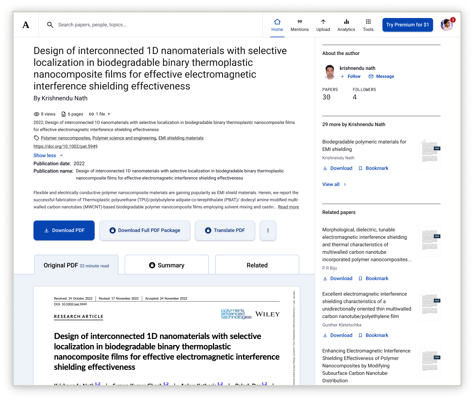
Winner!
This variant represented the full extent of our new design direction. It included a new primary blue, new typography, revised corner radii, a thoughtful spacing system, consistent text link styling, and some restyling components.
Let’s learn more about the most consequential improvement made to Academia’s design system: design tokens.