
Creating a scalable design token system
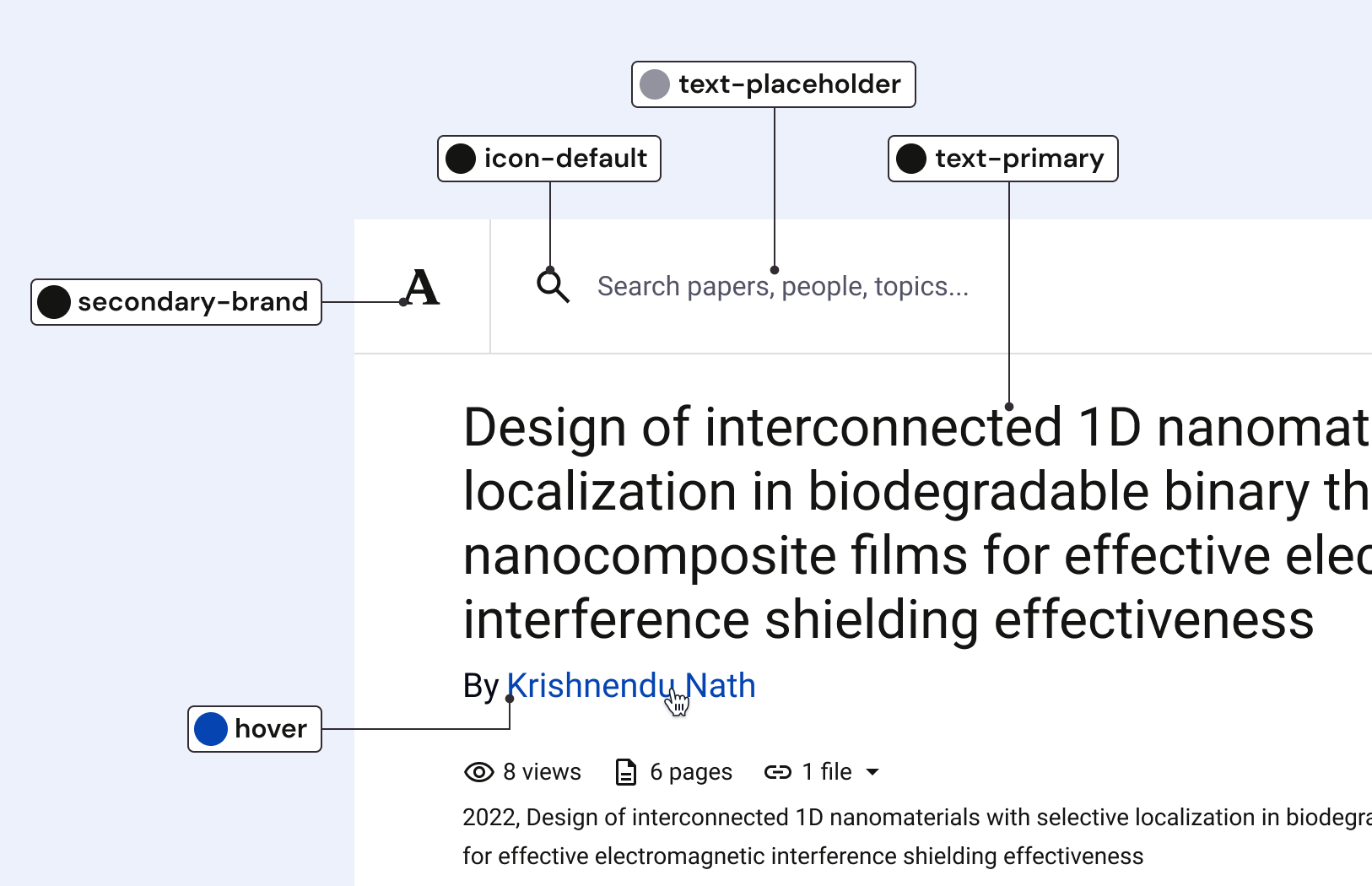
The token system became the most consequential improvement made to Academia’s design system. The three-tier architecture brought real structure to our design decisions, scaled with our team, and carried us through a full brand refresh.
Here’s how we built it.
Building the system beneath the system
60-second summary
The problem
The design system was not tying design decisions directly to design tokens. Components were constructed using primitive-named values and as they designed, designers had to remember or reference documentation for the best practices of responsive type, color, and spacing usage.
This led to inconsistent styling and inefficient workflows.

Key decisions
The first priority was translating our styles to primitive and semantic variables. It was important to create a strong foundation before I began mapping.
Overall usability was my core concern as I structured and named variables. I wanted them to be equally understandable to designers and engineers.
Lastly, it was important for the system to be scalable. Our system was still in its early stages and I wanted to build in flexibility.
My role
I led the token architecture from start to finish: naming and organizing variables, then mapping them across components. I collaborated with one of our frontend engineers to determine a process for importing tokens into the codebase and the plan for maintaining token consistency.
I also checked in regularly with the rest of the design team to gut check naming structure and token organization.

Impact
Documenting our token system and using it in our design process became one of the most consequential improvements I would make to the designer-engineer relationship. We starting speaking the same language and the Figma design library became a much better representation of what was in code.
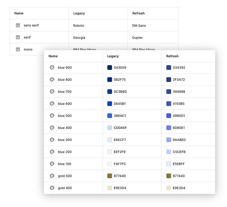
The creation of the token system aligned with our new brand refresh. I was able to build legacy and refresh modes into the system so all design work could support both styles with zero extra effort.

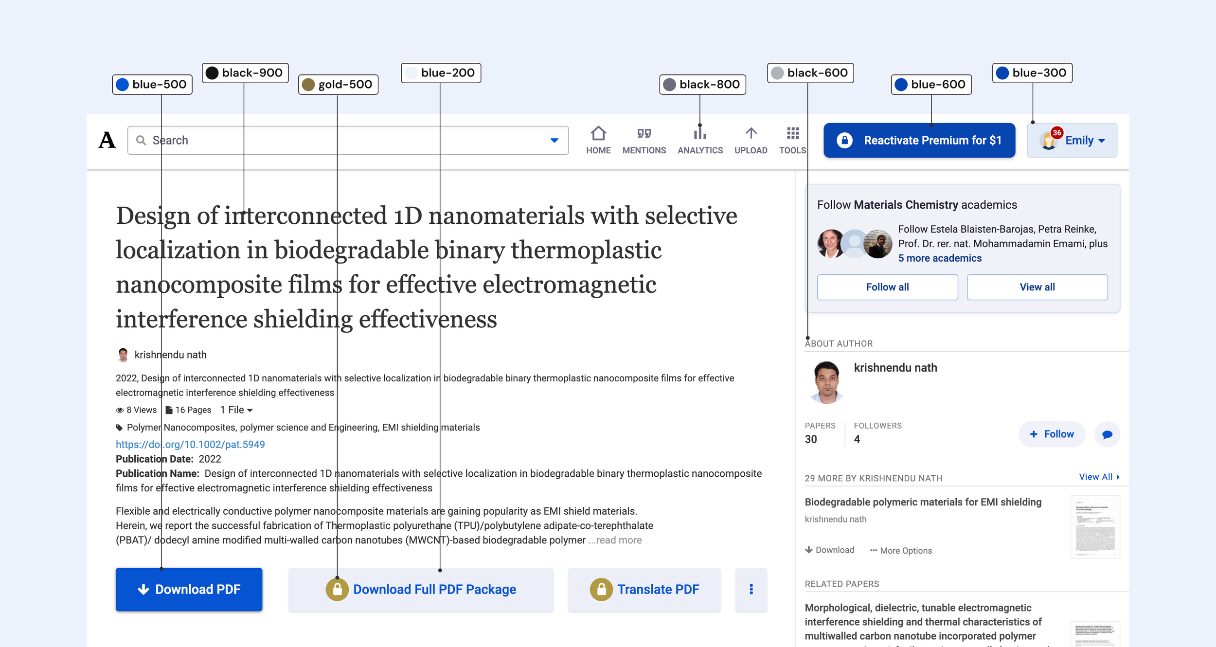
The problem
In the early days of the design system, type and color styles were the extent of automated variables.
Beyond that, designers had to reference documentation and/or remember the best practices of color and spacing usage.
Consequently, we had inconsistent and inefficient usage.
Goals for our v1 token set
Create an overall token solution to align and communicate proper design use
Allow for quick and accurate extension of the system in necessary instances
The introduction of tokens aligned with an ongoing brand redesign. Rather than waiting for the new brand to be completed, we decided to maintain parallel modes within our token collections to represent both the legacy and refreshed design variables. This allowed designers to design features in either (or both) styles with zero extra work.
My role
I led the token architecture from start to finish: naming and organizing variables, then mapping them across components.
I collaborated with one of our frontend engineers to define the process for importing tokens from Figma into our codebase. We also worked together to define a plan for maintaining token consistency.
All the members of the design team were consulted on naming structure and token organization. I had regular check-ins with the team to gauge token usability and scalability. As new tokens needed to be added, designers could either ask me to handle it, or I could provide support so they could do it themselves.
The workflow
The first step was to define our primitive tokens. Our primitive tokens represented our exhaustive color scales and type characteristics. The goal was for these to be accessible, but not front-and-center for use within Figma.

Next, are semantic tokens which communicate intended use. This level of tokens are what allows for broadest impact. Custom UI and new components can easily take advantage of these use-case-based colors.

The final layer is component tokens. These are used in the construction of specific components. They are hyper-specific but allow for consistency across component sets.

Typographic tokens
A particular benefit of adopting the token architecture was the ability to map our responsive type system to Figma’s existing type style organization.
By creating breakpoint-adaptive tokens for type sizes and line heights, responsive sizing could be accurately shown in Figma mock-ups without any additional work on the part of a designer.
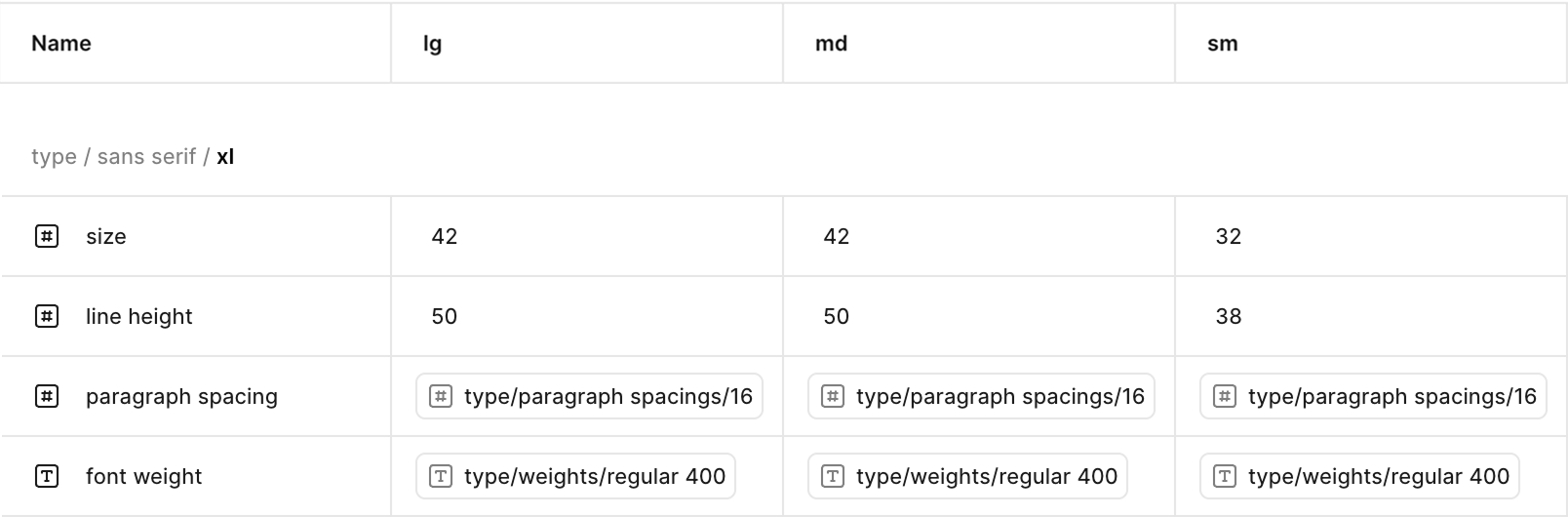
Our responsive type scale was defined across breakpoints in a separate Breakpoint mode
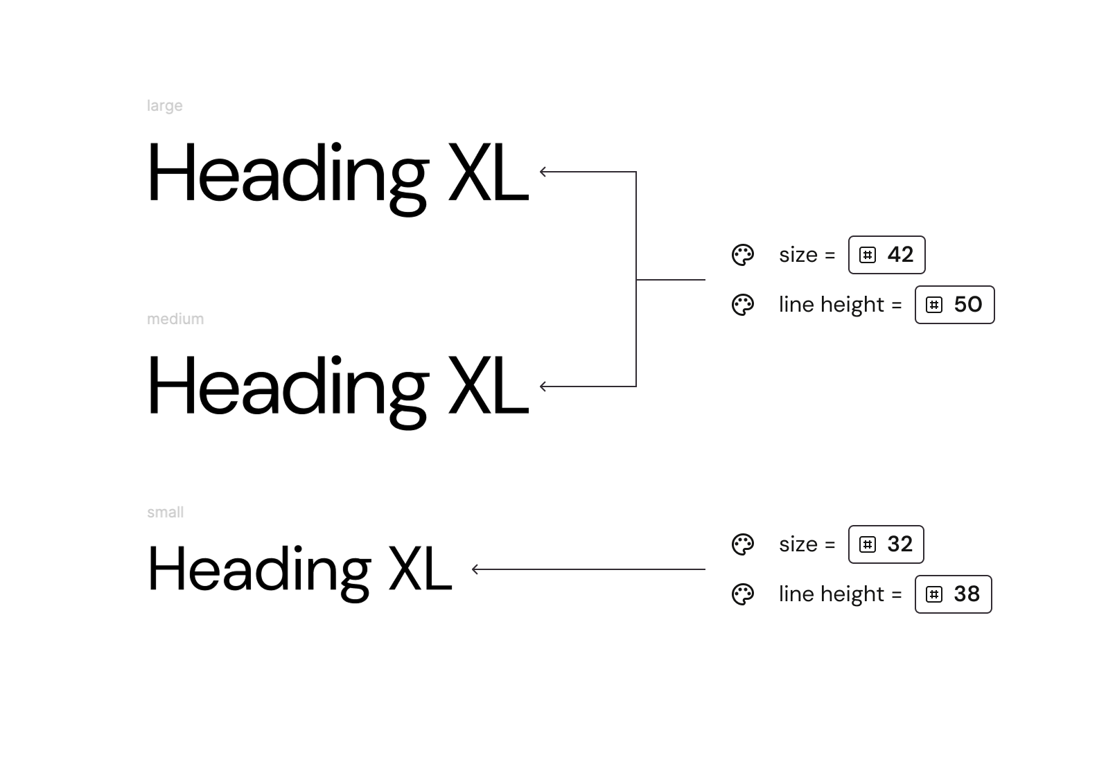
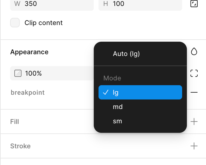
Controlled by selecting the right breakpoint in variable mode
In addition to typography, our responsive token collection allowed us to tie our grid system variables to tokens. Designers got breakpoint-specific styling for free by setting the variable mode of their designs.
Component building with tokens
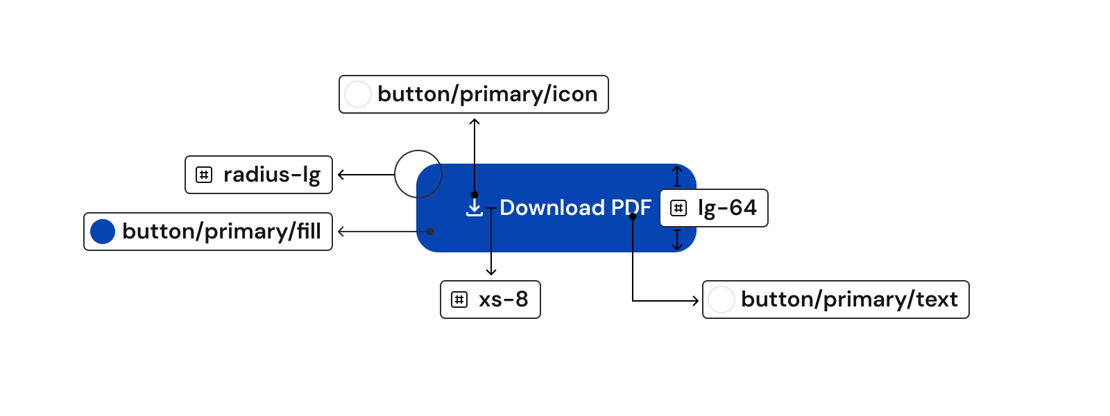
Brand characteristics start to emerge as you build your components using your system’s tokens.
Take our primary button as an example. Here is a breakdown of the tokens that make it up:
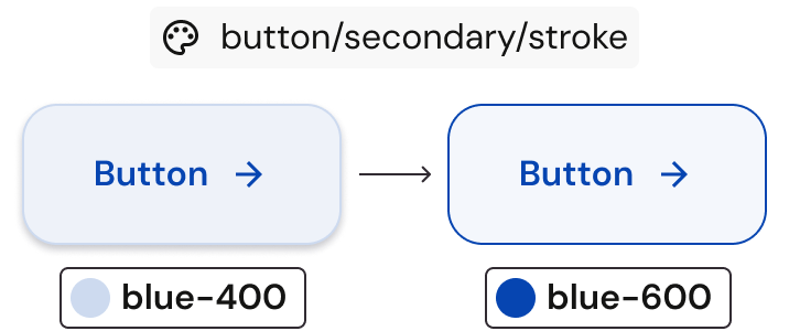
This simplifies future revisions. When we revised the outline color of our secondary button, it was as easy as redefining the corresponding token and re-exporting.
Lessons learned
Building the first version of our token system was inherently iterative and we leaned into that from the start.
Once the tokens were active, I would regularly touch base with the designers during our weekly design review. These check-ins led to the addition of more variables, re-organizing, and value tweaks. We had 100% adoption from the design team.
As our engineering team started building with AI tools we also saw the hallucination of design variables. To resolve, we’ve incorporated regular maintenance and stronger rules restricting the creation of new variables.
In Q1 2026 I was able to dedicate time to improving the overall token system. I incorporated all our learnings from our first version, plus additional refinements identified through hands-on use.