
Design system
An Academia case study • 2024
Academia’s new component library is an enterprise-scale design system I built from the ground up
I led the creation of the company's first global design library, establishing a comprehensive foundation of design tokens, components, and scalable patterns that transformed how design and development teams collaborate.
This is where we started…
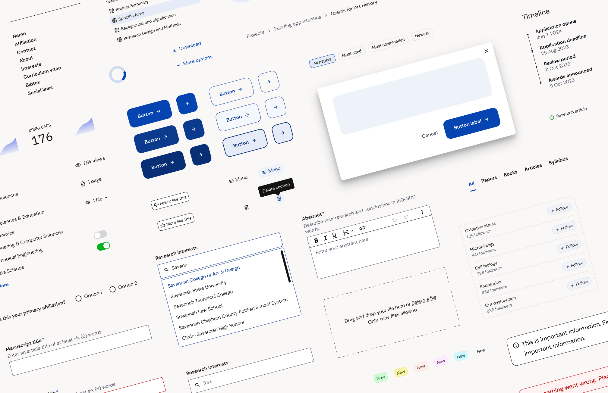
We had a component library* but no design system. Each team had its own unique component library, which resulted in many inconsistencies.
*debatable
The plan & process
It was important to build components and a system to absorb ongoing changes. I began building it while a parallel rebrand exercise was kicking off so I knew incorporating the new brand direction was in our future.
How I planned for future changes


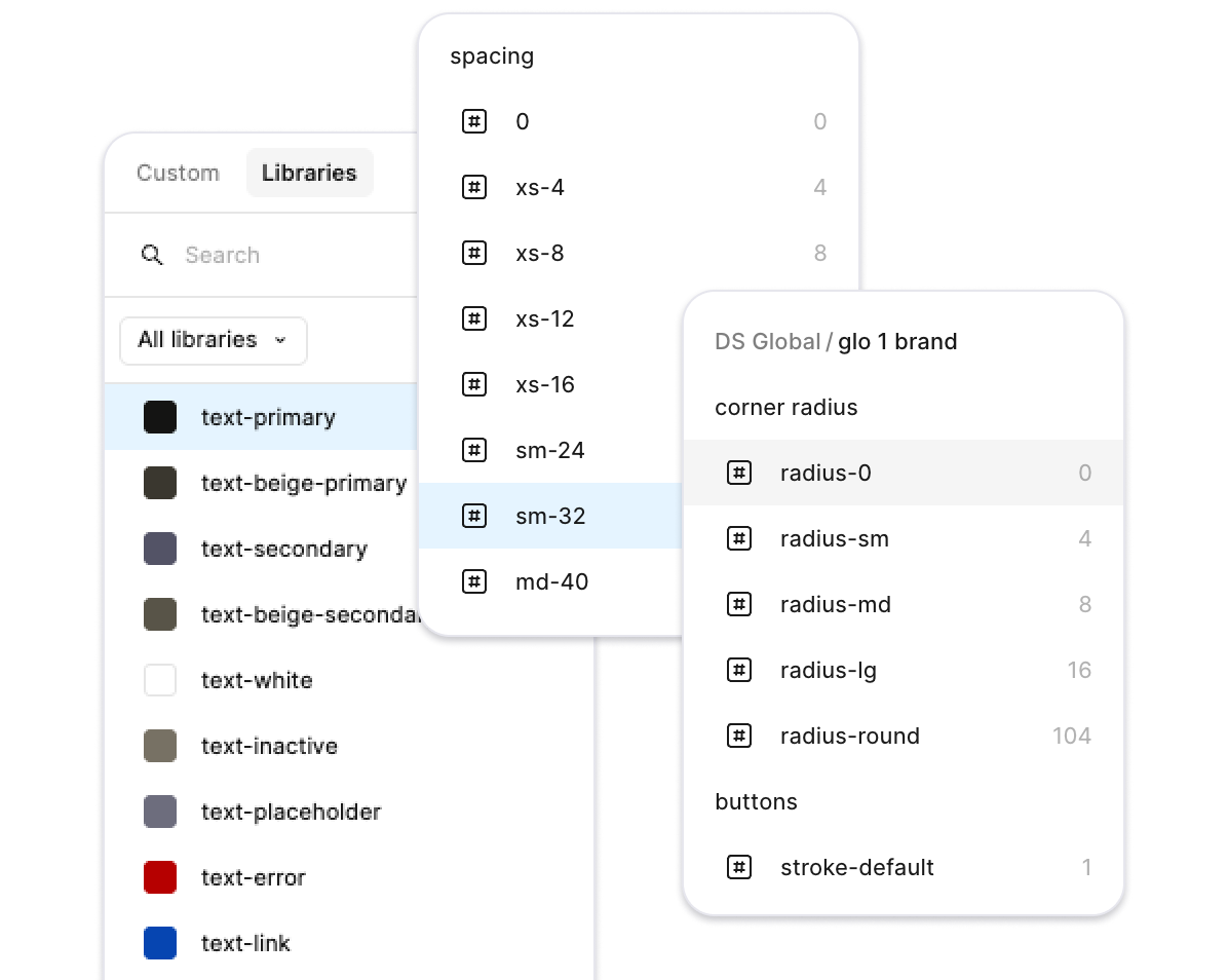


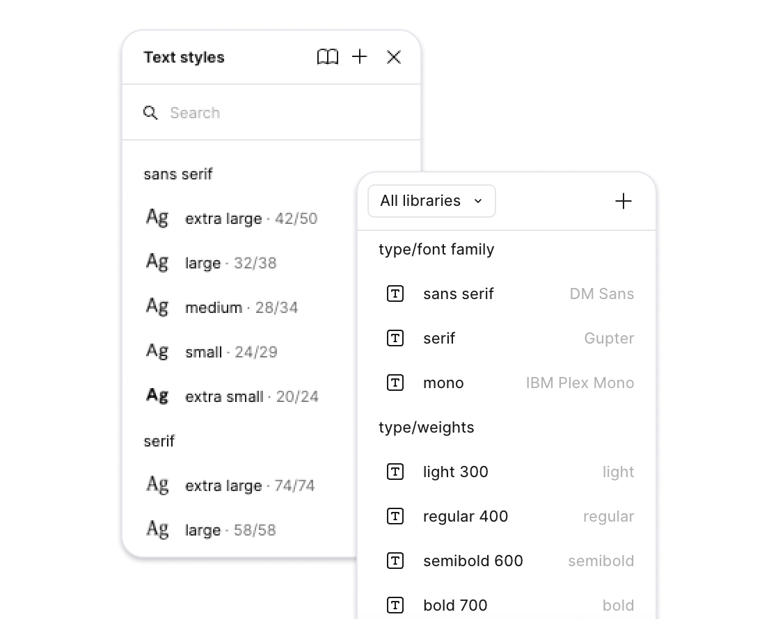
Tied type styles to tokens
Relied on design tokens as much as possible
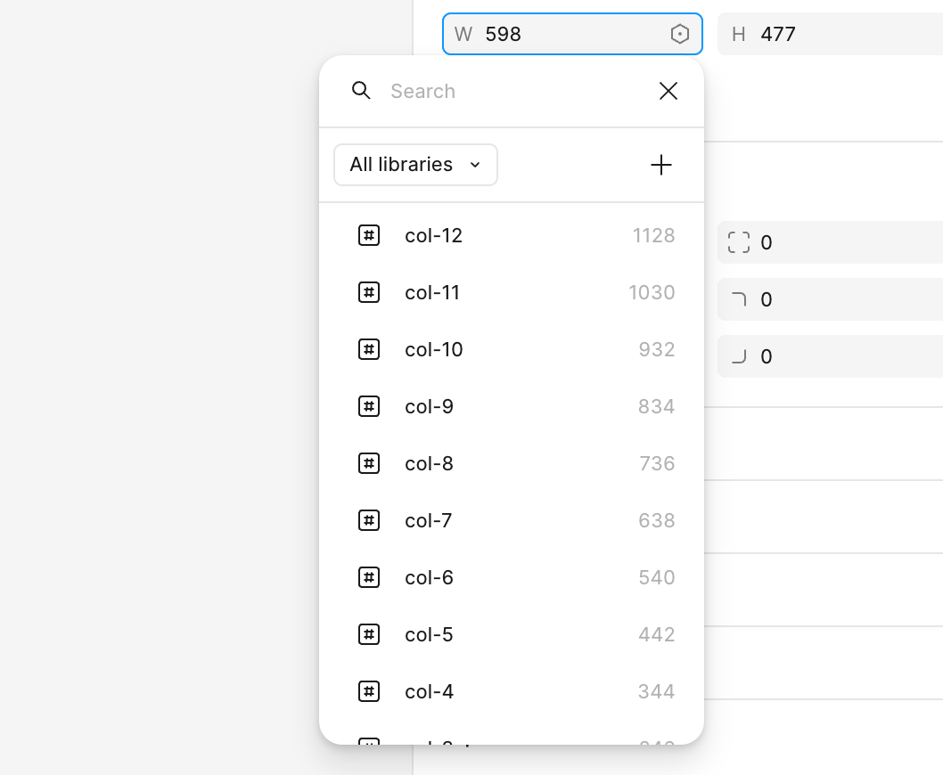
Got ahead of file bloat by creating a multi-library system
Used semantic naming
Our system has 200+ components, 278 tokens, and 24 type styles.
Rules & structure
A guiding principle for the design system was to keep friction as minimal as possible.
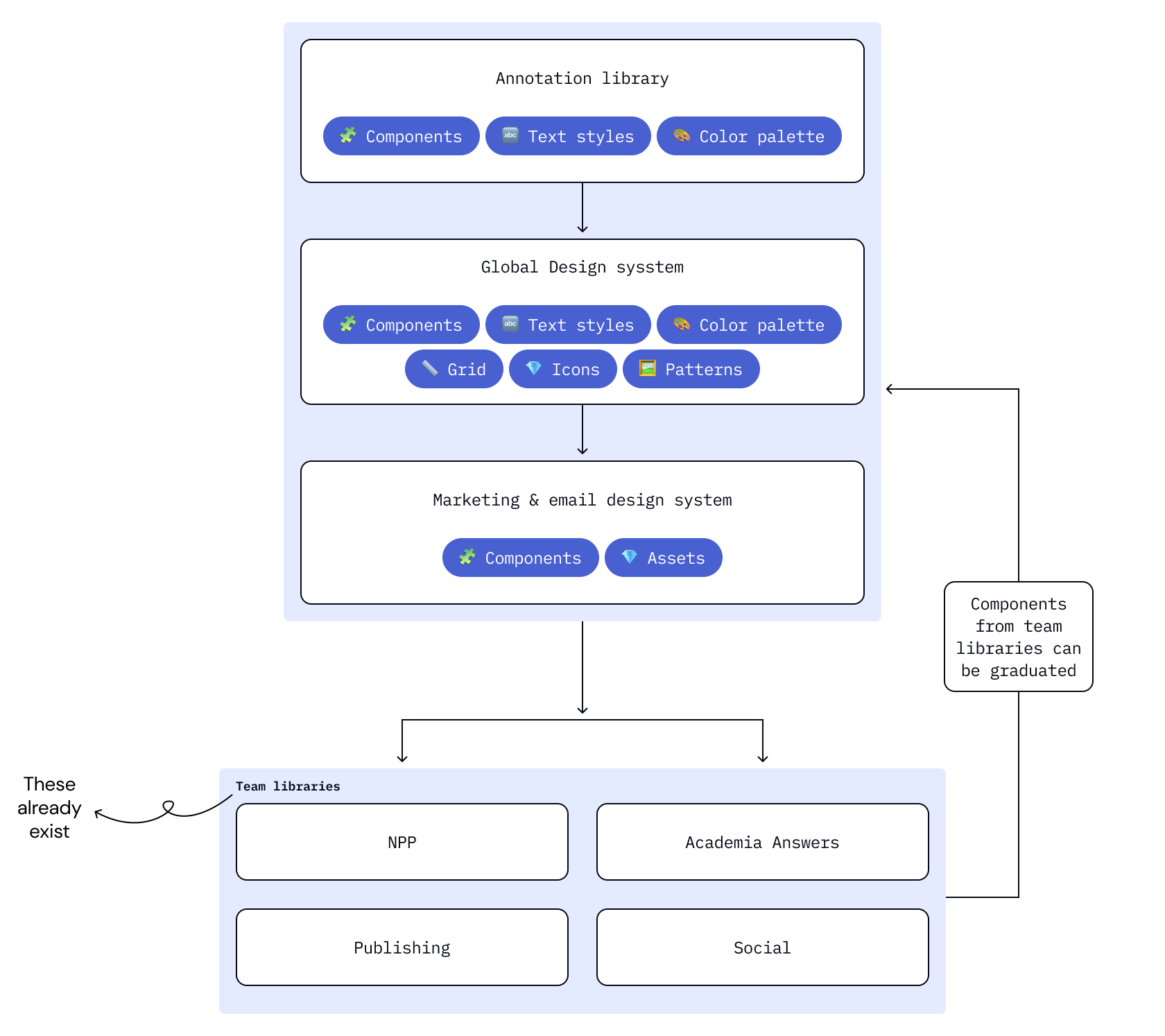
At Academia, individual teams have specialized component needs. Instead of requiring our global design system to house all components, we limit the global system to flexible components used across our product experience.
This allows each product designer to keep and manage their product team’s distinct component library.
When a component’s use expands beyond that of a single product, it gets “graduated” to the global design system.

Design system goverance
Roles & responsibilities

We are a small team of 3-5 designers

I manage the design system and act as point person for component and system-level changes.
I partner with engineering for technical requirements and work with any engineer who is building a component into Storybook.

Any member of the team is free to make updates, component requests, or new components. They just must follow documentation and change-log requirements.

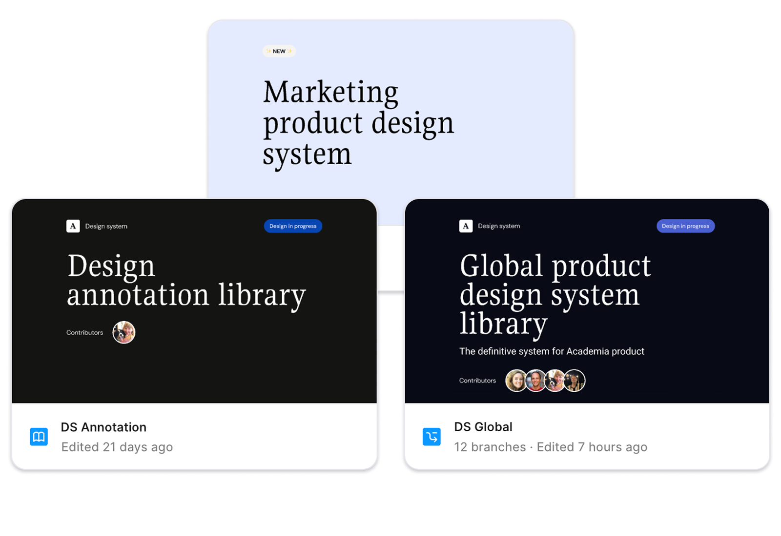
I worked with our Brand Designer to create separate Marketing & Email libraries. I offer file and component support but he is the point person for all Marketing decisions.
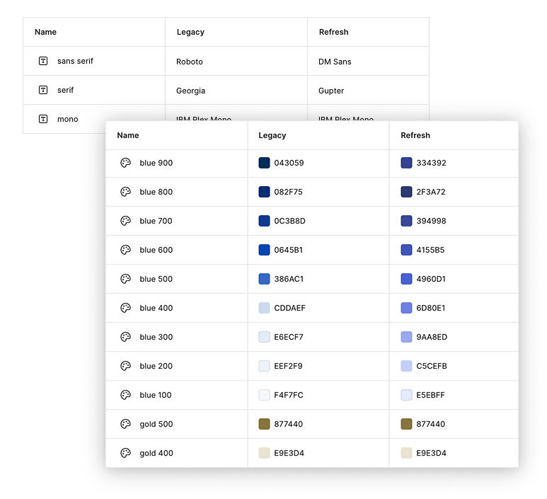
Design variables & tokens
I led the implementation of design variables into our system. They proved invaluable during our brand redesign.
We maintained parallel collections representing both the legacy and refreshed design variables. This allowed designers to design features in either (or both) styles with zero extra work.
This culminated in the ability to transition our entire component library through a single change with zero disruption to ongoing projects.
Data-driven design validation
We applied an analytical approach to quantifying the impact of design when we incorporated the new styling introduced by a recent brand redesign.
We A/B tested our highest-revenue pages to gain a detailed understanding of how the design changes affected our most important metrics.
An incomplete list of things changed:
Primary brand color
Type styles
Corner radiuses
Spacing increments
Text links
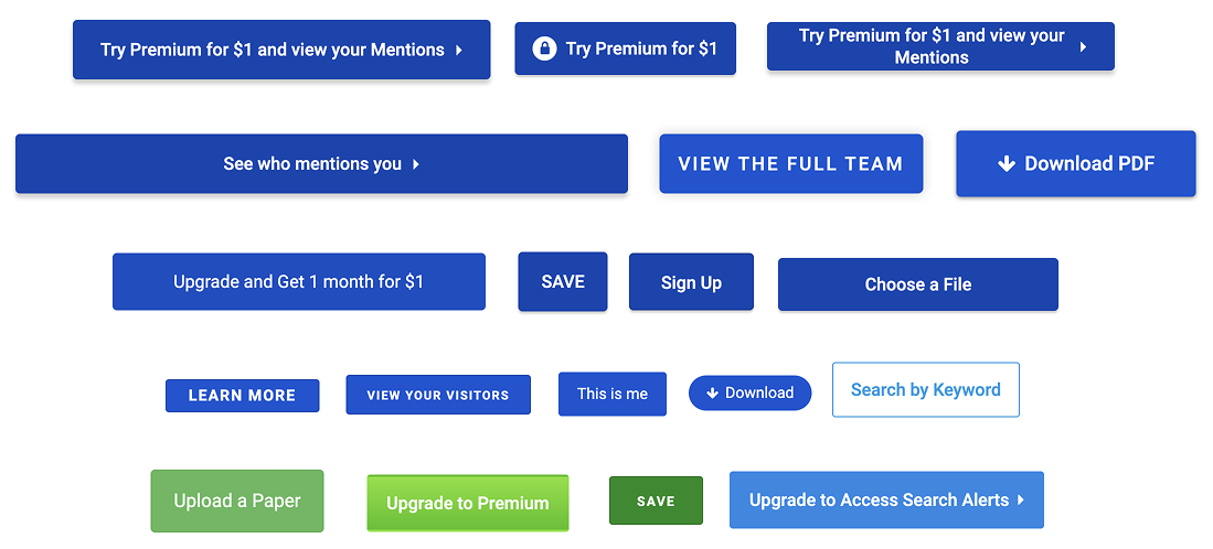
Button styles
Icons
Some restyled components
Winner vs. control
A/B test results
Increase in paper downloads
Boost in content impressions
+5.68%
+4.5%
+1.5%
Improvement in
Premium conversions
Logged in single work page variants
Control
Represented our legacy design elements & styling.
Some changes
Introduced to minimize fears that the design changes had gone too far. Did not adopt new typefaces, brand color, or restyled components.
Winner
More changes
Adopted the full extent of our new design direction which included a change to our
primary brand blue.
Let’s learn more about the most consequential improvement made to Academia’s design system: design tokens.